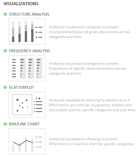
Visualizations: Structure Analysis
Use with examples such as Education, Age Groups, Occupation, and other types of single-response questions that sum to 100%.
Visualizations: Frequency Analysis
Use with examples such as Reasons for Purchase, Hobbies, Incentives Received, and other types of multi-response questions.
Visualizations: Scatterplot
Use to show the relationship between sets of values.
Allows up to 4 KPIs/metrics at a time (x-y positions, bubble color, and bubble size) for specific categories and over time.
Visualizations: Bar/Line Chart
Use to create charts depicting data in bars or lines, or in a combination of bars and lines on the same chart.
Charts can be oriented either horizontally or vertically.