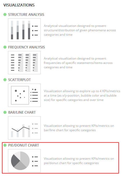
Pie and/or Donut Charts are available with the other visualization types (Structure, Frequency, Scatterplot, Bar/Line).
By nature of a pie chart, the data shown will sum to 100%.
Note: The percentages of multichoice questions can often sum to over 100% because each respondent is given the chance to provide more than one answer.
If a multichoice question is chosen for a pie chart, the percentages will be recalculated to use a response base instead of the usual respondent base, so the percentages will sum to 100%.
Begin by changing the tab template to a Pie/Donut Chart.
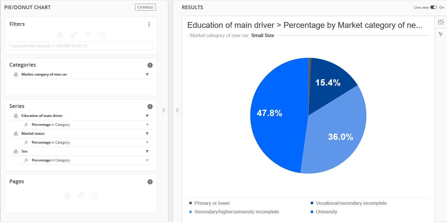
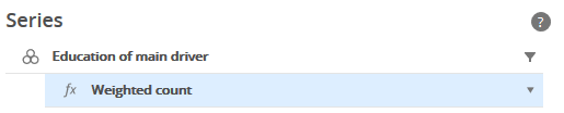
At least one question is required in the Series panel to display a pie chart.
To make the results of the pie chart more meaningful, add a question to the Categories panel.
Multiple questions can be included in the Series and/or Categories panels.
Optional questions can be included in the Filters and/or Pages panels.
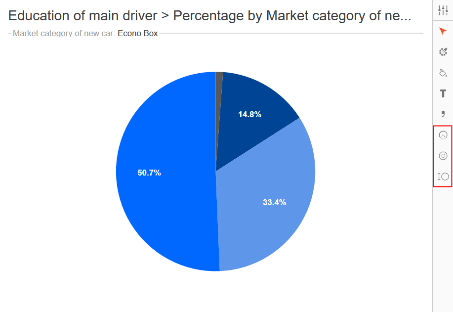
After the pie chart is displayed, additional chart formatting can be done in Analyze by clicking the arrowhead icon in the upper-right corner.
This will display additional icons for editing the pie chart.
|
|
Arc Options
|
|
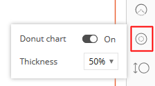
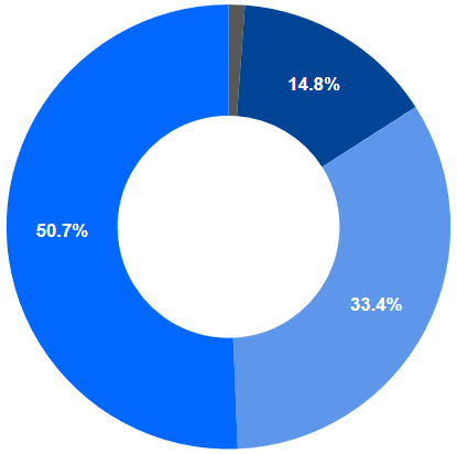
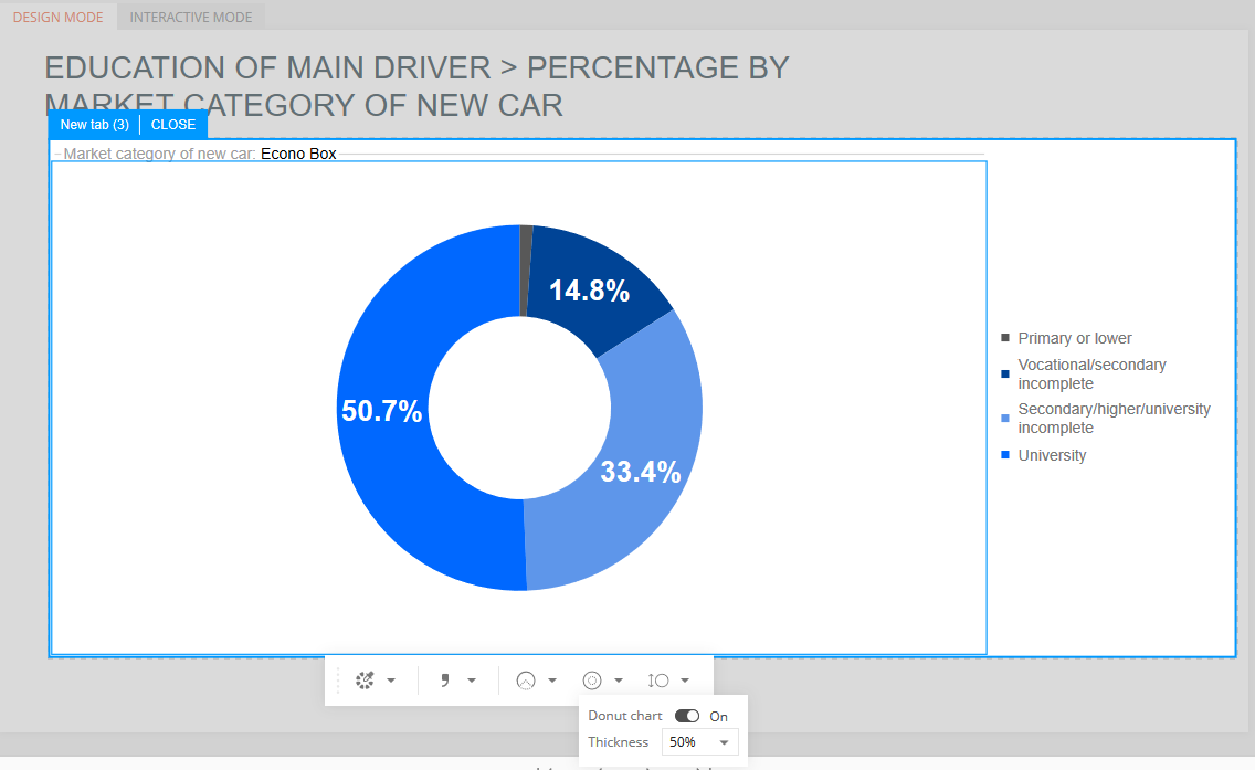
Donut Chart
|
|
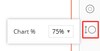
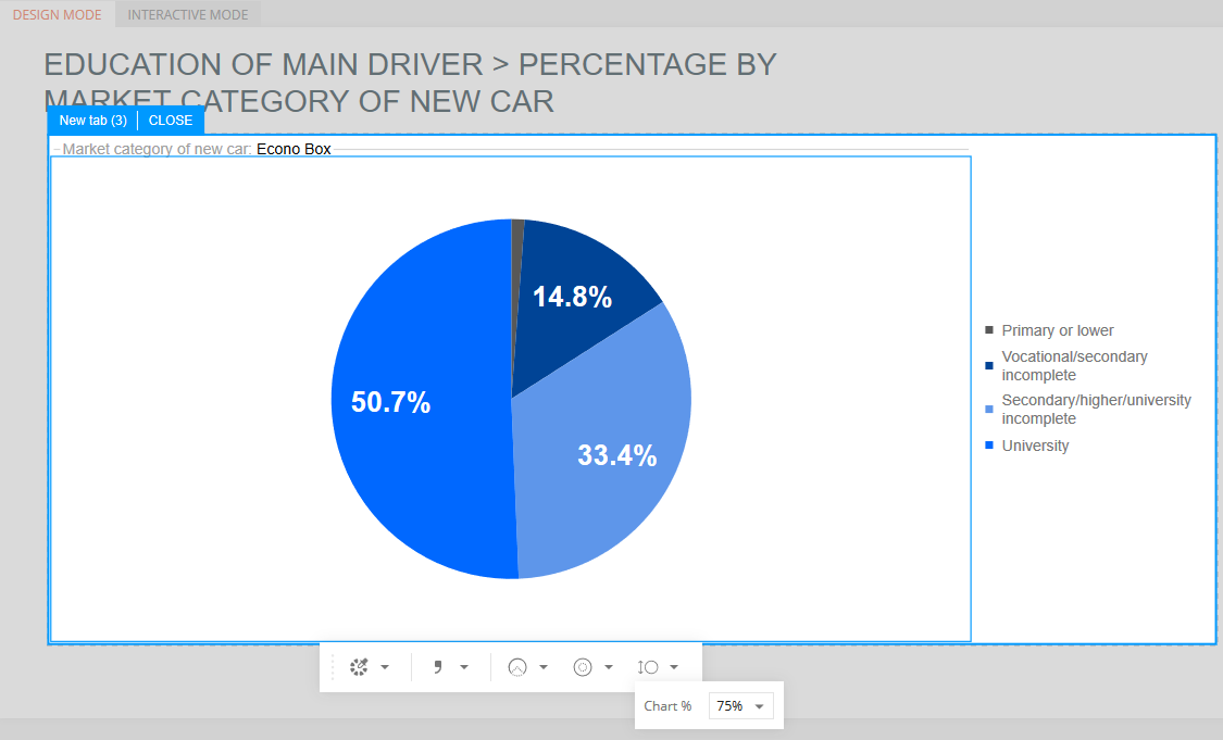
Chart Size
|
There are three format icons that are specific to pie charts, which are available when the arrowhead icon is clicked in Analyze.
-
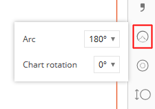
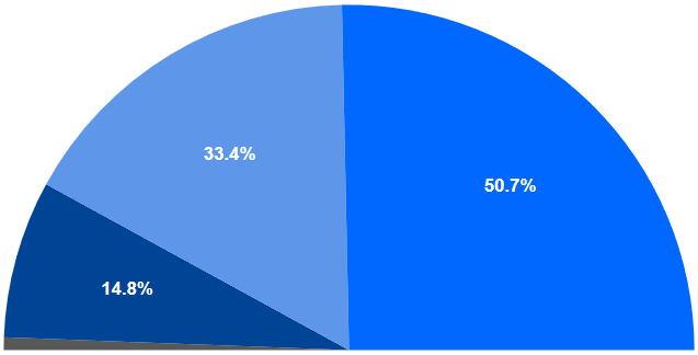
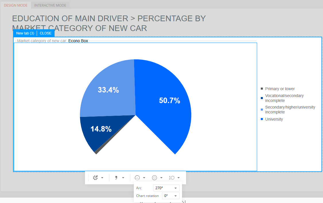
Arc Options - Adjust the pie chart to show a 90, 180, or 270 degree orientation, instead of 360.
-
Donut Chart - Add a hole to the center of the pie chart.
-
Chart Size - Adjust the size of the chart on the slide.
The initial chart defaults to displaying a pie chart, but it can be changed to an arc or donut chart with these icons outlined above.
Arc Options
Click the circular icon with a triangle to change the circular pie chart to an arc.
Show the chart as 90, 180, or 270 degrees, instead of 360.
The arc will still sum to 100%, even though it is no longer a complete circle.
The arc options can be applied to either the pie chart or donut chart.
Donut Chart
Click the circular icon with a dotted middle for the donut chart options.
Use the slider control to change the pie chart to a donut.
The size of the donut hole can be changed by selecting a different percentage.
Chart Size
The size of the pie or donut chart can be adjusted by clicking the circular icon with double arrows.
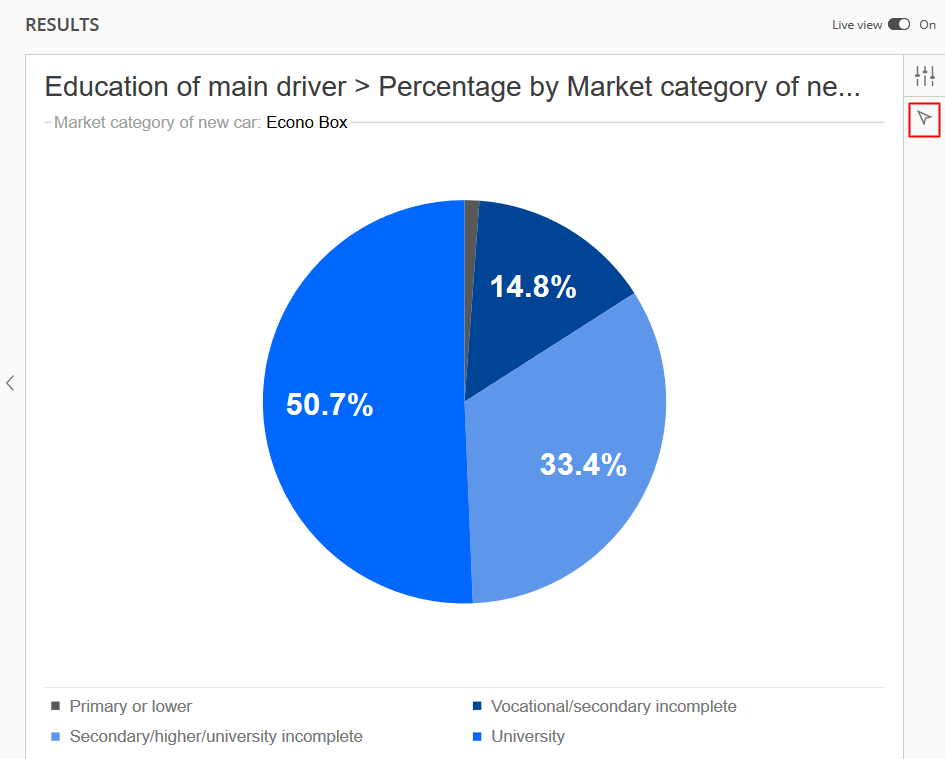
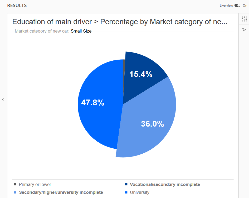
Highlighting Segments
Any segment of a pie chart can be selected and highlighted.
Multiple segments can also be highlighted.
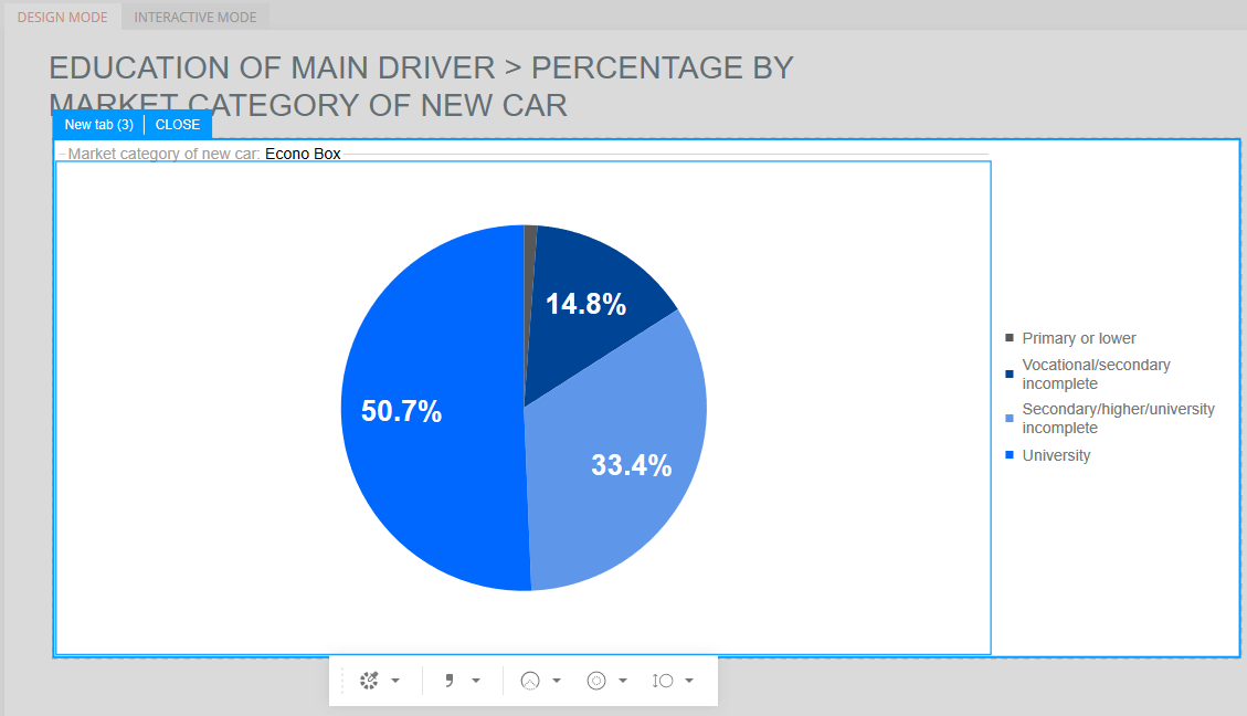
Note: if the chart is currently being edited with the arrowhead icon selected, click the arrowhead icon to exit the editing before proceeding to highlight a segment.
Before continuing, any additional icons below the arrowhead icon should no longer be available. This indicates that the chart is no longer being edited.
Click on a segment to highlight it.
The highlighted segment will appear expanded and the legend label will be changed to a bold font.
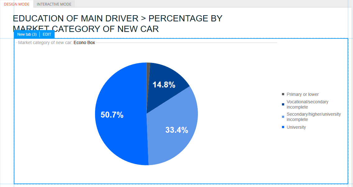
In this example, the "Vocational/secondary incomplete" segment is highlighted and the legend label is in a bold font.
To highlight more than one segment, click on an additional segment and it also will appear expanded in comparison to the remaining segments.
Click the highlighted segments again to remove the highlights and return the chart to the normal view.
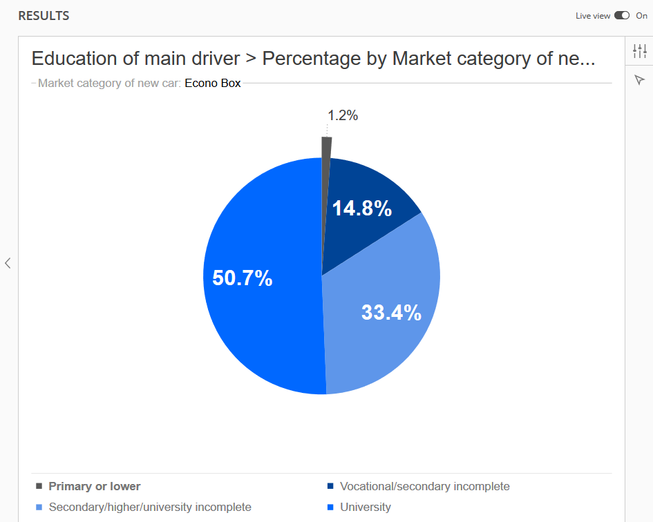
Highlighting Smaller Segments Without Data Labels
Sometimes, a data label will not fit inside a segment of the pie chart (see the thin gray segment in the example below).
Those segments that are too narrow to fit a data label inside will display the label outside of the chart, if highlighted.
Click the segment once to highlight the segment and display the data label (1.2%) outside the chart.
Click the segment again to remove the highlight and label.
The data label (1.2%) will no longer be displayed.
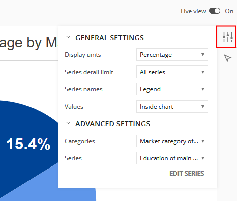
Pie Chart Settings
Click the icon in the upper-right corner to expand the General and Advanced Settings.
General Settings
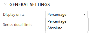
Display Units
By default, percentages are shown in the pie chart.
The units can be changed from percentages to absolute values.
'Absolute' will show the actual counts in the pie charts instead of percentages.
To display absolute values in the pie chart, go back to the query panel and change the output style for the question that is being used for the pie chart.
Change the style from Percentages to either Weighted Count or Unweighted Count.
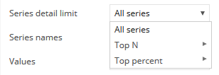
Series Detail Limit
'All Series' is the default setting, which means every response with data is included as its own segment in the chart.
'Top N' or 'Top Percent' will only include the top specified value or percentage of responses and will combine the remainder in a newly created "Other" segment.
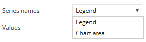
Series Names
'Legend' is the default, which includes a legend at the bottom of the pie chart.
The 'Chart Area' option replaces the legend and displays legend labels outside of each segment.
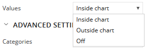
Values
Data labels are displayed inside the pie chart by default.
The 'Outside Chart' option will move those data labels to the outside of the chart.
One benefit of using the 'Outside Chart' option is that all labels will be shown, even those that were previously hidden because the label would not fit inside the smaller segments.
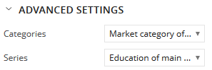
Advanced Settings
If multiple questions were included in the query for Categories and/or Series, each of the questions will be available as an option.
Select different options in Categories and/or Series to change the questions used for the pie chart.
Editing Charts In Compose
After including the pie / donut chart(s) on slides in Compose, the charts can be edited without going back to Analyze.
While in the Design Mode of Compose, click the chart to display a blue Edit tab in the upper-left corner.
Click the Edit tab to display the chart edit options in Compose.
Arc Chart - Edit in Compose
Donut Chart - Edit in Compose
Resize the Chart in Compose
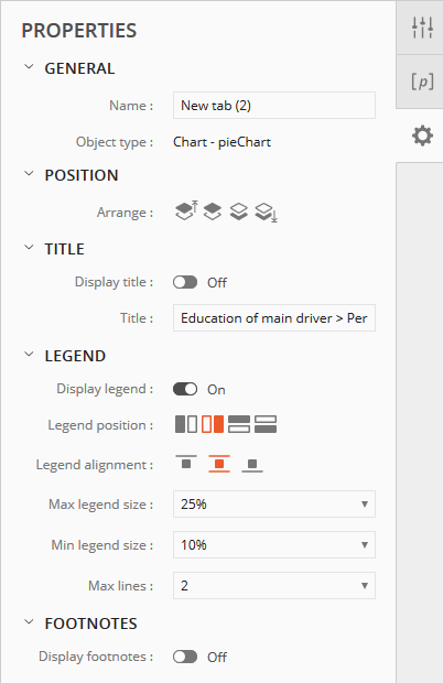
Click the Properties icon in Compose for additional format options.