Manually Specifying Axis Ranges
Setting the minimum and maximum values of axis ranges is supported when working in either Analyze or Compose.
It is possible to manually set the minimum and maximum values in a Scatterplot or Bar/Line chart, and the maximum value of an axis in a Structure or Frequency chart.
The minimum value for Structure and Frequency charts is set to zero.
Manually specifying the axis values can be done in either Analyze or Compose.
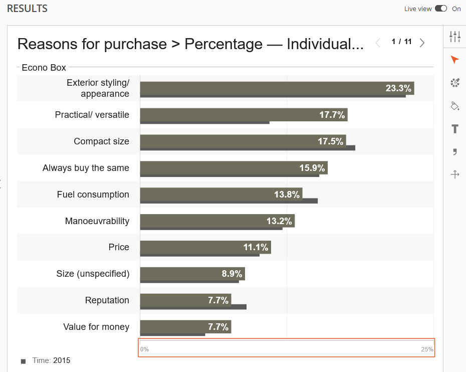
This example shows changing the axis values on a Frequency Analysis in Analyze.
To edit the axis in Analyze, begin editing the chart by clicking the arrowhead icon on the right menu.
Next, click the axis labels.
After making a selection, the axis labels will be outlined in red and an additional axis icon with intersecting lines will appear in the right menu.
Click this axis icon to manually change the maximum value (and/or minimum value, depending on the chart being edited) of the selected axis.
In this example, 0.25 was entered as the maximum value.
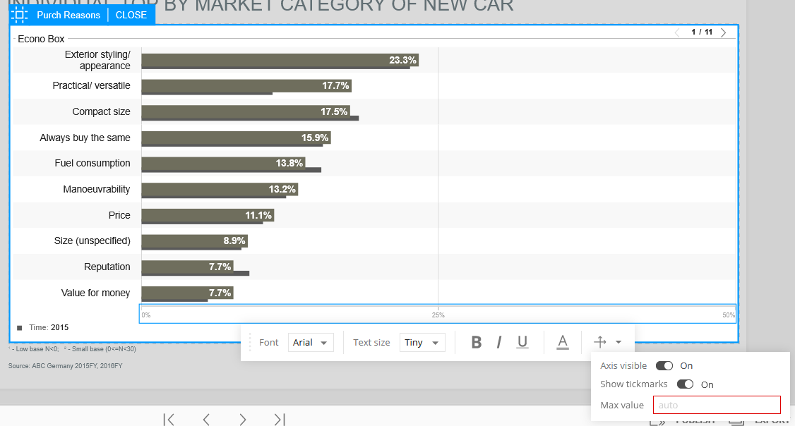
The axis values can also be changed in the Edit Mode of Compose.
After getting into Edit Mode, click the axis labels and the menu bar will appear.
Click the axis icon (the intersecting arrows) to display the options for changing the axis value(s).
Depending on the chart that is being edited, there may be options to edit the minimum and maximum values.
With Structure Analysis and Frequency Analysis charts, the maximum value is only an option for editing.
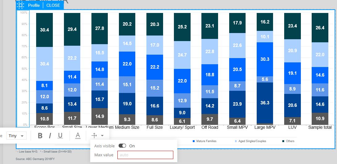
Example of editing the axis of a Structure Analysis.
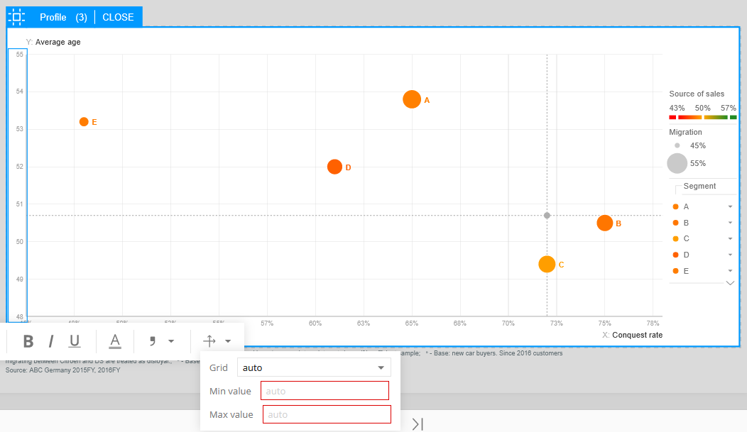
Example of editing the one of the axes of a Scatterplot.