How to customize the displayed values on your chart?
When you add a query with one or more questions to your chart, you can modify the displayed data using the Display Data section. Here is an example to help you understand:
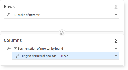
In the Crosstab in Query, there is "Make of new car" in the rows and "Segmentation of new car by brand" and "Engine size of new car" in the columns. In the Display data section, you will see that "Categories" include "Make of new car," and "Series" include "Segmentation of new car by brand."
If you want to change the question displayed in categories, you can select "Segmentation of new car by brand" and "Engine size of new car," or choose "None" to leave the categories section empty.
Similarly, if you want to change the question displayed in series, click the option, and you will see a list of available questions like "Engine size of new car" and "Make of new car."
All the categories that were not used in either categories or series, such as "Segmentation of new car by brand" and "Engine size of new car," will be available as separate options (pages) in the Display data section. This allows you to focus your analysis more effectively and those separate options will work as if they were additional filters. If you have already added some variables to the Pages panel in Query, then those questions will always be displayed in the Display data section as pages and these cannot be selected in either categories or series.
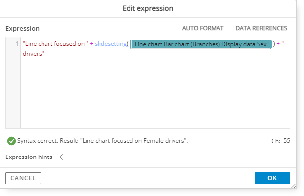
If you select additional dimensions via Pages (those additional categories that were not used primarily on the chart) and you want to include this fact in the title or in the legend of the chart, you can utilize expressions. Follow the example:
You have a basic line chart to which you added a filter via pages e.g.;
Your analysis is focused only on female drivers, so you select female from the drop down list;
Then you can go to the title section and select EXPR. In the expression modal which appears on the screen, we can use the “SlideSetting” option. It should bemused in the following way:
“Any title you prefer[add space if necessary] ” + slidesetting (@specific setting) + “ additional description”
Important points:
If you want to have space between words, add space inside the quotation marks, otherwise, the outcome will not have any spaces.
In order to search for a page setting please start with the open bracket and then typing “at” sign (@...) and close the bracket.
Using the “SlideSetting” option will dynamically adjust the page title if there are any further changes e.g., you change the Display data settings from “Female” to “Male”.
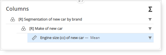
Important: Since Compose charts allow you to manipulate how category variables are translated to the chart dimension, it is not that important how those variables are positioned against each other in the Query tab (crosstab, pivot). The same visual result can be achieved in Compose for any order of nesting, as well as for any distribution of variables across calculation/category panels in the Query tab. The specific choices in query structure can impact the default assignment of variables to specific fields, i.e., which variable is assigned to categories and which one is assigned to series by default on the chart - something which can be then freely modified in the Display data section.