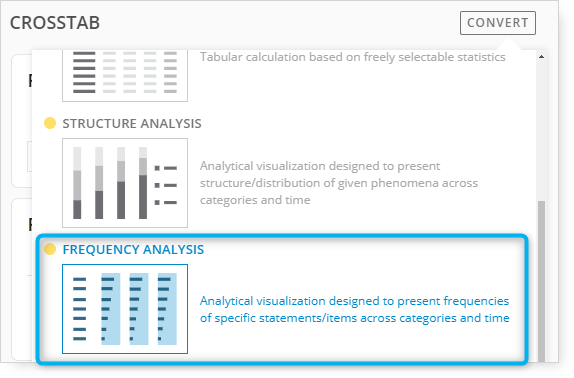
Frequency Analysis might be used when working with multichoice questions such as Reasons for Purchase, Problems Experienced, Item Characteristics, and other types of questions where the percentages sum to over 100% because a respondent can choose more than one answer.
Frequency Analysis can also be used with single-response questions such as Education, Age Groups, Occupation, and other types of questions that sum to 100% if the visualization and layout options of Frequency Analysis are preferred over what is offered in the Structure Analysis options.
The following example includes a description of options and settings that can be used when preparing a Frequency Analysis visualization.
Please follow the steps presented below:
1. Begin by changing the tab template to Frequency Analysis.
2. The next step is to drag and drop the required questions into Filters, Categories, Statements, Time, and Pages panels.
Multiple questions can be included in the Categories and Statements panels.
Optional questions can be included in the Filters panel.
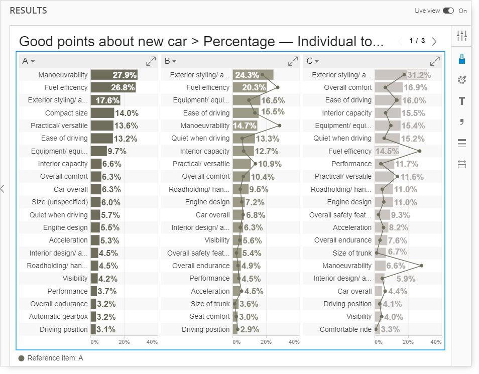
Categories
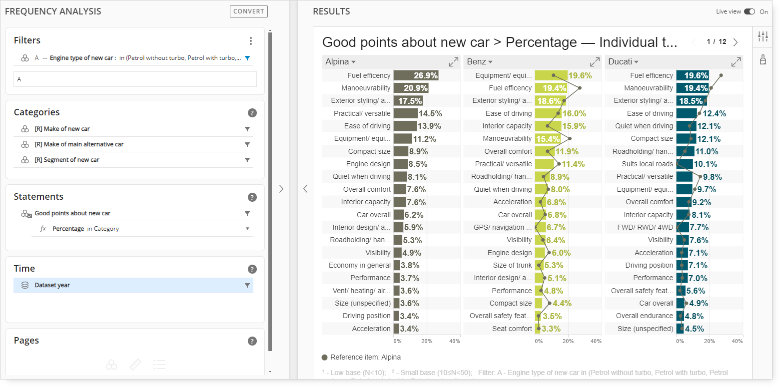
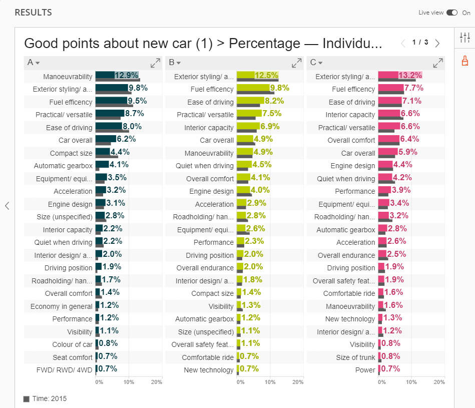
The Categories panel includes the Make of the New Car, the Make of the Main Alternative Car, and the Segment of the New Car.
Statements
Include multiple questions in the Statements panel to expand the options for analysis.
In the visualization above, each make of new car displays responses from the Good points about new car question, sorted in descending order.
Time
Adding the Dataset Year to the Time panel allows for the trending and benchmarking data across years.
By default, the most recent year will be displayed initially. Optional settings can be activated to introduce multiple years of analysis.
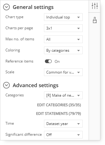
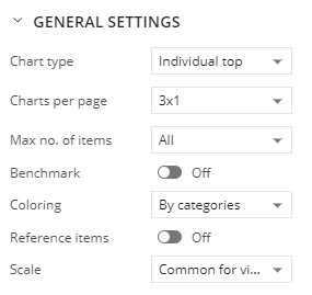
Category Settings
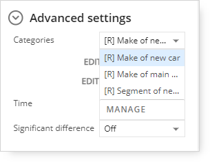
Expand the Advanced Settings options and click the Categories drop-down menu.
In the example above, Make of New Car, Make of Alternative Car, and Segment of New Car were included in the Categories panel during setup, which makes them available as options in the Categories menu.
Selecting the Segment of New Car menu option changes the analysis from Make of New Car to Segment of New Car.
Note the Segment of New Car descriptions:
'A,' 'B,' 'C,' and Sample Total are at the top of the charts in the chart title and the < 1 / 3 > notation in the upper-right corner.
Clicking < 1 / 3 > will advance through each segment category, so < 2 / 3 > will display the following three charts for each segment category.
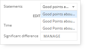
Statements Settings
Click the Statements drop-down menu.
In the example above, Good points '1', '2', '3', and '4' were included in the Statements panel during setup, which makes them available as options in the Statements menu.
Selecting a different question in the Statements menu will change the responses and legend of the bar charts. The bars will populate using the newly selected question.
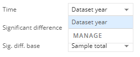
Time Settings
During the query setup, multiple years of data were included.
Since the Dataset year was included in the Time panel, trend and benchmark options by year are available.
By default, the Benchmark menu will be set to 'Off.'
Switch on the Benchmark if you want to display It on the page. It is displayed as a dark grey bar just below the bar that displays the current values for each answer.
A trend analysis for the two most recent years will be shown.
By default, the Benchmark option adds a period that is next to the most recent.
Since 2016 is the most recent year, 2015 data was added to the visualization in the form of a secondary gray bar.
A new notation for Time: 2015 has also been added.
To specify a different benchmark year, click on the year label. Clicking the 2015 label displays the other available year options in this example.
Additional Interactive Features
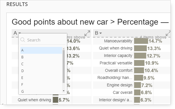
Clicking on a category label at the top of the chart changes the display order of the categories.
In the example above, clicking the label 'A' will expand the menu to allow to select a different category to display in its place.
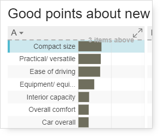
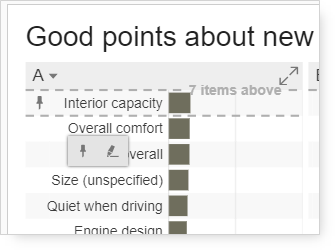
If the list of responses that are included as bars is longer than what can be displayed vertically, a scroll bar on the right of the chart will appear when the mouse hovers over the chart.
When scrolling down, a notation will appear to inform the user that x items appear above the scrolling position.
In the example above, eight items appear above the position the user has scrolled.
Hovering over a label/bar temporarily highlights the same label across all displayed charts. This allows for easy tracking and comparisons.
When the user hovers off the label, the highlight will be removed.
To make the highlight appear, even when the you move off the label, click on a label, and the highlight icon will appear

.
Clicking the highlight icon will highlight each mention of the response across each of the charts.