Most users will have their default query template in Query set to crosstab. This template is the standard for tabular reporting. The output typically includes percentages or means, percent of the total (subset and/or sample), and unweighted total count. You have the flexibility to create your own custom format style. Since multiple statistics can be included per response, there are better options for building visualizations. Visualization needs to know precisely what statistic should be plotted for each specific data point/response.
When creating queries for visualizations, the output from crosstabs typically might not be specific enough. One statistic must be associated with each response, and that data must be formatted in a specific way that is optimized for feeding the visualization.
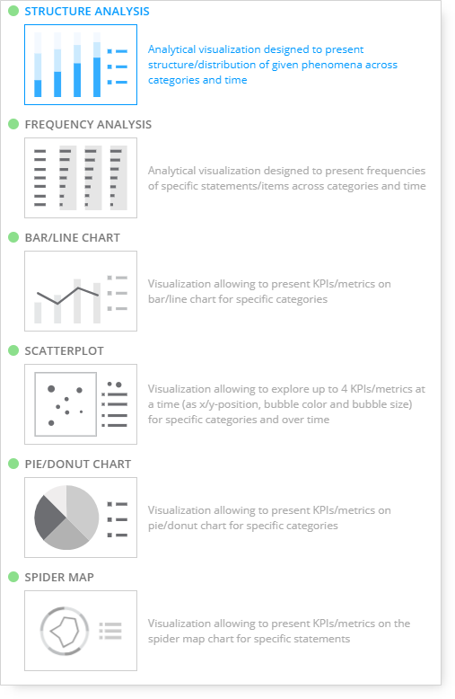
When creating visualizations, six visualization templates are available instead of the crosstab template:
Structure Analysis
It includes Categories and Series instead of panels for rows and column output.
Questions used in Categories and Series can be nested.
This chart type is used with examples such as Education, Age Groups, Occupation, and other types of single-response questions that sum to 100%.
Frequency Analysis
It includes Categories and Statements instead of panels for rows and column output.
This chart type is used with examples such as Reasons for Purchase, Hobbies, Incentives Received, and other types of multi-response questions.
Scatterplot
It includes Categories and KPIs instead of panels for rows and column output.
Allows up to 4 KPIs/metrics at a time (as x/y position, bubble color, and bubble size) for specific categories and over time.
This type of chart shows the relationship between sets of values.
Bar/Line Chart
It includes Categories and Series instead of panels for rows and column output.
This chart type is used to create charts depicting data in bars or lines or a combination of bars and lines on the same chart.
Charts can be oriented either horizontally or vertically.
Spider Map
It includes Categories and Series instead of panels for rows and column output. On the chart, you can display all or selected answers for the question included in the ‘Categories.’ What is added to the ‘Series’ is shown as the markers on the chart, and these markers are connected if the response is available for more than one answer for the question used in ‘Categories.’ Optionally, you can provide a Time dimension to be used as a 2nd category level on the page. You can visualize the data as a Spider Map or Line Chart.
Pie/Donut Chart
It includes Categories and Series instead of panels for rows and column output. At least one question is required in the Series panel to display a pie chart. To make the pie chart results more meaningful, add a question to the Categories panel. Multiple questions can be included in the Series and/or Categories panels. Optional questions can be included in the Filters and/or Pages panels.