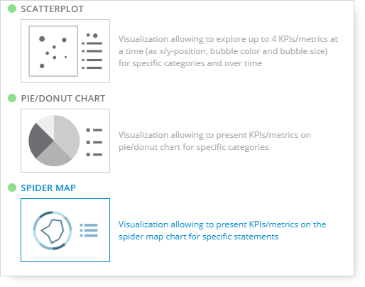
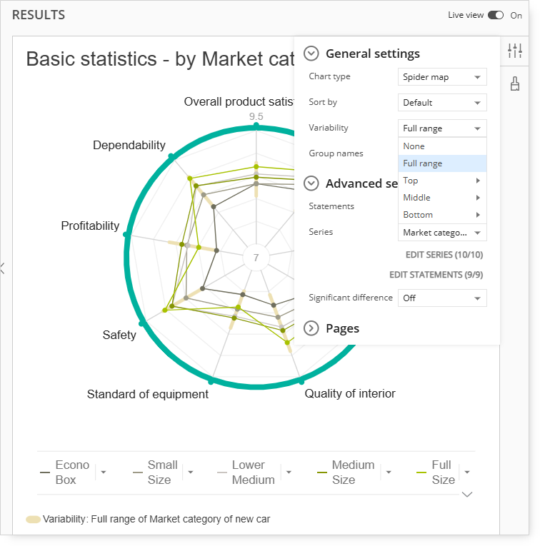
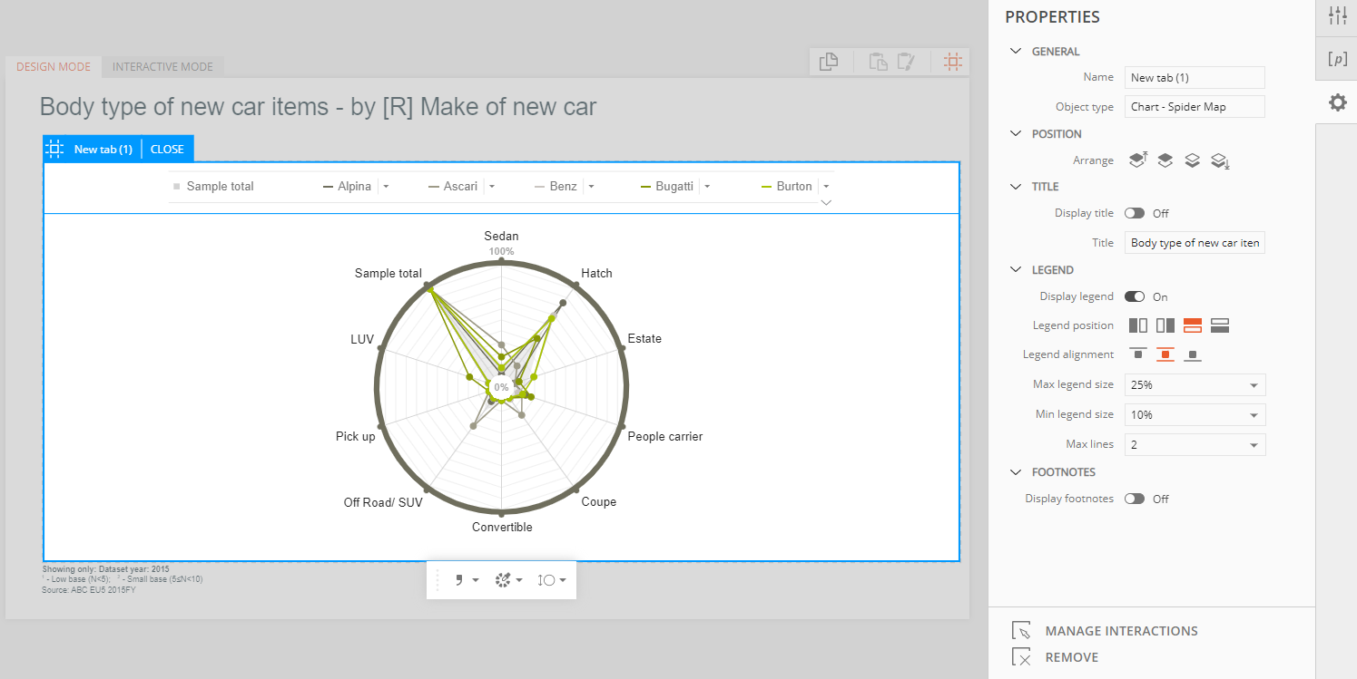
Spider Map is the visualization available in Query. It is possible to access it, as all other visualizations, from the `Change` menu in the 2nd column of Query view.
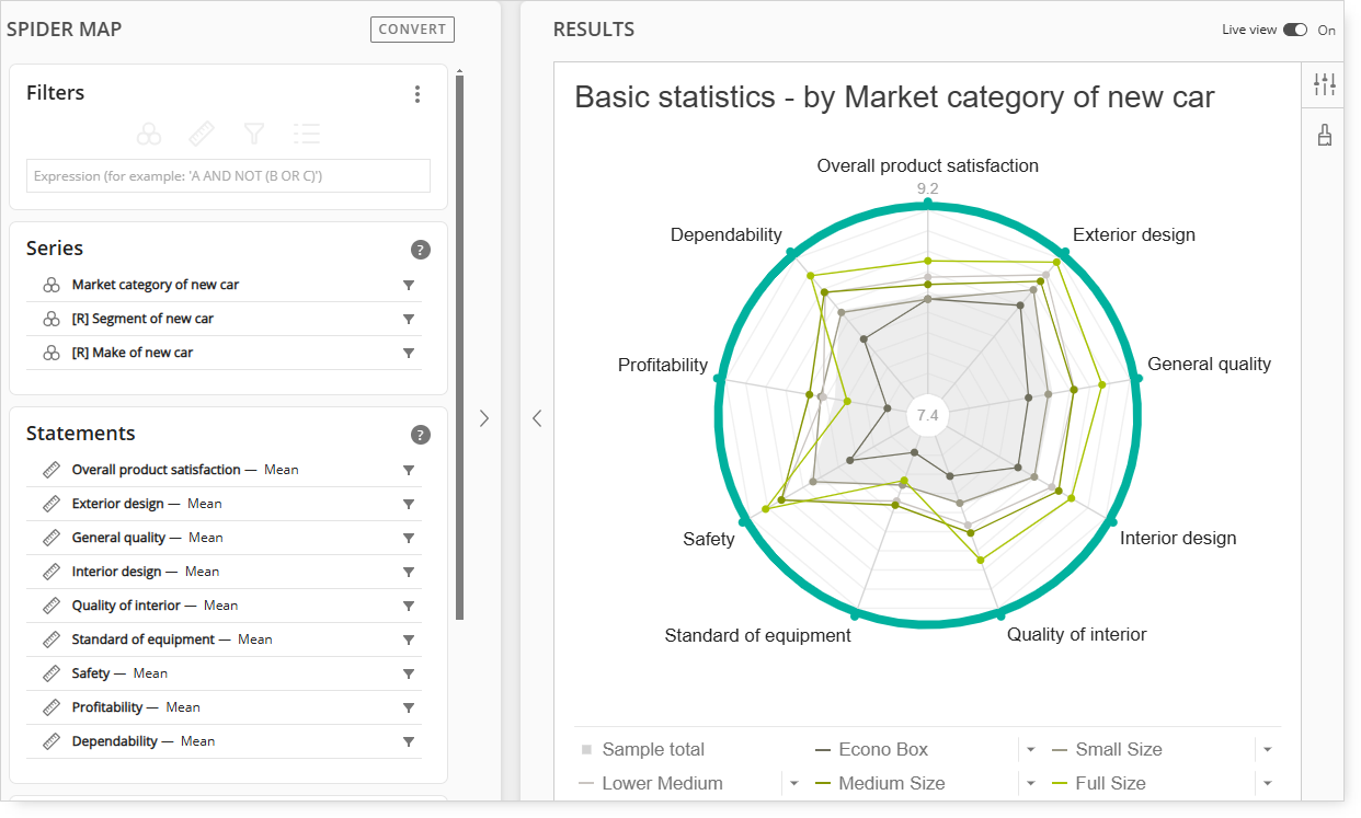
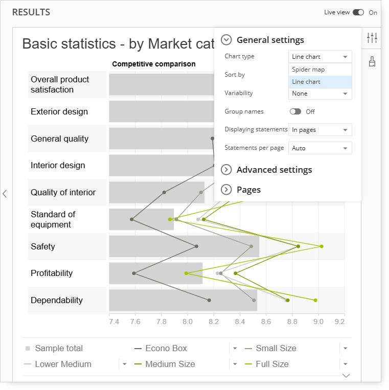
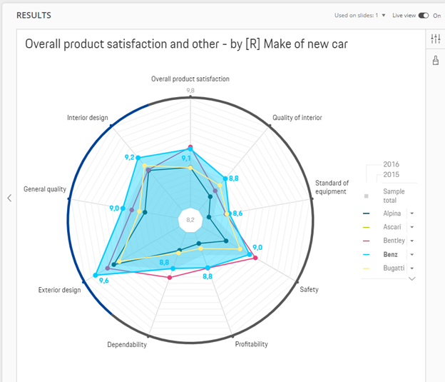
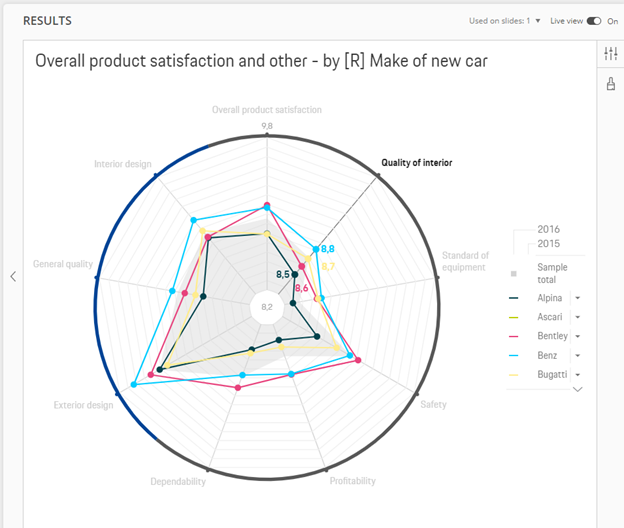
On the chart, you can display all or selected answers for the question included in the ‘Categories.’ What is added to the ‘Series’ is shown as the markers on the chart, and these markers are connected if the response is available for more than one answer for the question used in ‘Categories.’ Optionally, you can provide a Time dimension to be used as a second category level on the page. You can visualize the data as a Spider Map or Line Chart.
Statistics or numerical questions can deliver calculated value if it is inserted into ‘Categories.’ If only a Categorical question is used, it requires statistics. A numerical question does not require additional statistics.
Spider Map
Line Chart
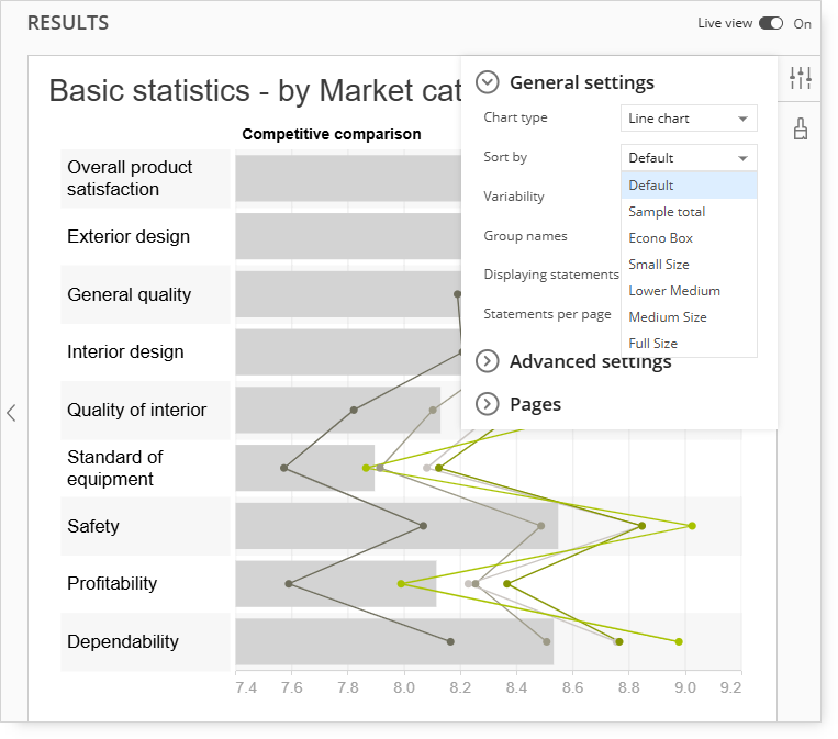
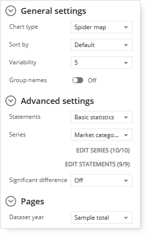
Sorting
You can sort the data by values of a specific series, which can be ascending or descending. To do this, the user should use the visualization settings and specify the item and the order of sort.
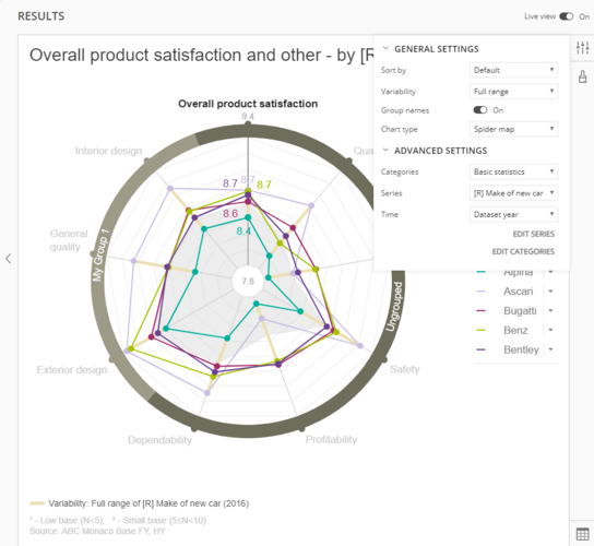
Variability
You can add a variability dimension to each category. The Variability displays a range of values for series items as specified in the settings. For example, you can display a range of values for all items in the series dimension or see how the results are spread across the top 5 items. Variability is depicted as a line on each of the categories.
Groups
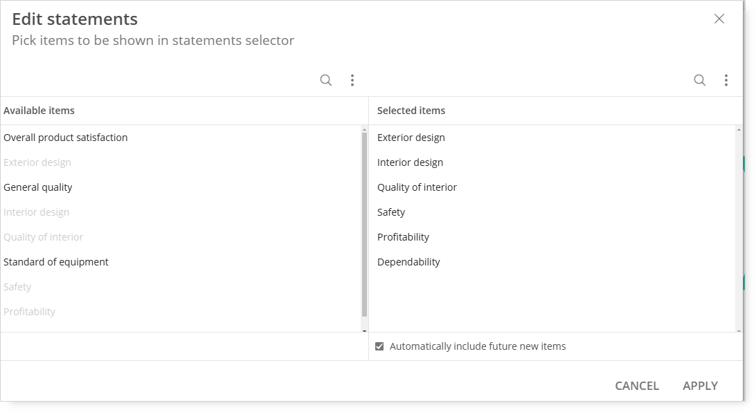
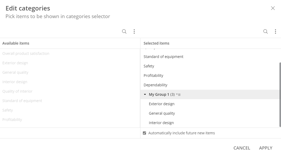
You can group category items in a custom way. To do this, you need to use the EDIT STATEMENTS option in the visualization settings at the bottom of the list. Then, you can select any number of statements and create a new group from the selection. The process can be repeated multiple times to create any number of groups. All of the items not included in a custom group will be displayed on the visualization as Ungrouped. When adding a group, you will be asked to provide a name for it.
Categories will be displayed on the ring based on groups, with an order based on the order in the edit categories window. They are identified by the color of the outer ring. The name of each category can be displayed by using a Show Group Names option in the visualization settings.
Interactions
User can interact with the chart in following ways:
1. User can click on a specific series (on the chart or in the legend). The series are highlighted and values for each of the category are displayed. NOTE: If only one series is highlighted, a fill is also displayed.
2. User can click on a specific category label and values for all series in that category will be displayed. Only one category can be highlighted at a time.
3. User can zoom in/out by scrolling on the graph. The zoom works based on the cursor position. User can also zoom in by double clicking.
4. Legend:
a. Enable/Disable item by clicking on a series indicator (line);
b. Highlight series by clicking on the label of series.
Legend position
There is a possibility to place the legend of the Spider map chart in the top, bottom of the chart or left/right side of the visualization.
'Legend position' option is available under Properties section on the right side of the screen.