Most users will have their default query template in Analyze set to Crosstab. This template is the standard for tabular reporting. The output typically includes percentages or means, percent of total (subset and/or sample) and unweighted total count. The user also has the flexibility to create their own custom format style. Since multiple statistics can be included per response, this is not ideal for building visualizations. A visualization needs to know exactly what statistic should be plotted for each specific data point/response.
When creating queries for visualizations, the output from crosstabs typically are not specific enough. It's necessary to have one statistic be associated for each response and also to have that data formatted in a specific way that's optimized for feeding the visualization.
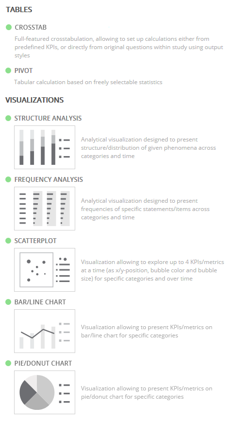
Five visualization templates are available to use instead of the crosstab template when creating visualizations.