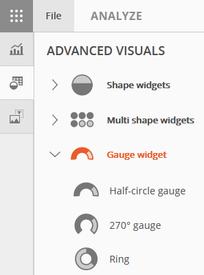
The Gauge Widget gallery is located beneath Shape Widgets and Multi Shape Widgets.
Select a Gauge Widget from the gallery and drag it to the slide. This example will use the Ring option.
The references used for Ring can also be applied to the Half-circle and 270 gauges.
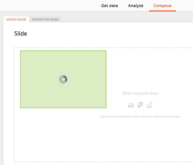
The slide will default to Design Mode.
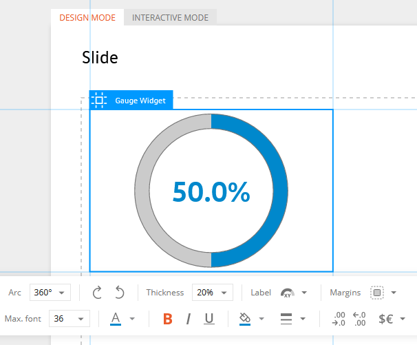
Click on the widget to bring up Edit Mode and display the toolbar for editing options.
Toolbar options:
VALUE - this is the expression builder/editor to assign data references to the widget
Range - turns on/off percentages and allows for specifying the min and max range (if applicable)
Arc - changes the widget shape from a full circle to an arc (270 or 180 degrees)
Direction arrows - rotates the gauge widget clockwise or counter-clockwise
Thickness - increase or decrease the width of the gauge widget
Label - specifies the placement of the data label; inside, outside, or none
Margins - settings for the border of the widget and label
The bottom row consists of mostly the standard editing options.
The following are some options specific to Widgets.
Increase/decrease decimals
Add a Prefix and/or suffix
Conditional Formatting
For steps on how to update the data reference or apply conditional formatting to Gauge Widgets, refer to the sections in the previous Data Widgets page.