Grid: Diverging Bar Charts, Benchmark Bars, Bottom 10 Sort
In this tutorial, we will guide you through the process of creating diverging bar charts using both positive and negative data points. Additionally, we will include benchmark bars for the previous year, and sort the data to highlight the bottom 10 entries. Follow these steps to effectively visualize your data with these advanced charting techniques.
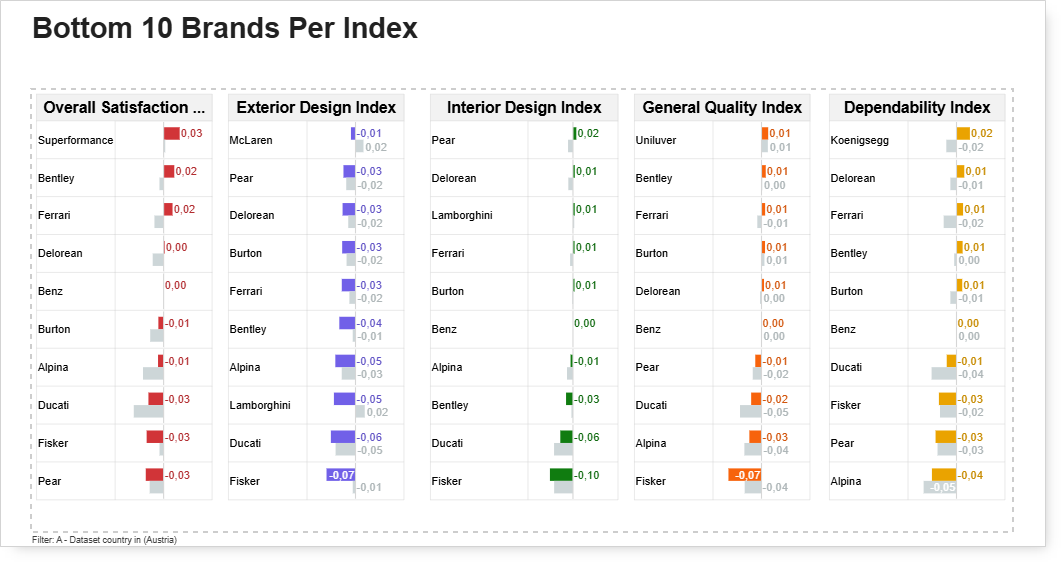
This should be the final form of the visualization.
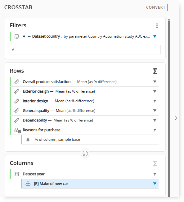
For reference, this is the crosstab setup.
-
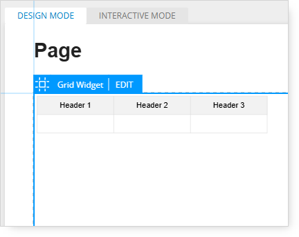
Start by adding a grid to a new page.
-
Click the Edit tab on the new grid to get into Edit mode.
-
For this example, the “vehicle brand” label will be added to the first column and the “index score” value (data) will be added to the second column.
-
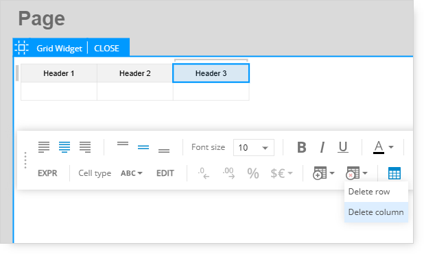
The third column is not needed, so it needs to be deleted.
-
Click on the third column of the grid (Header 3).
-
In the bottom menu bar, click the grid icon with the red X, then select the Delete Column option.
-
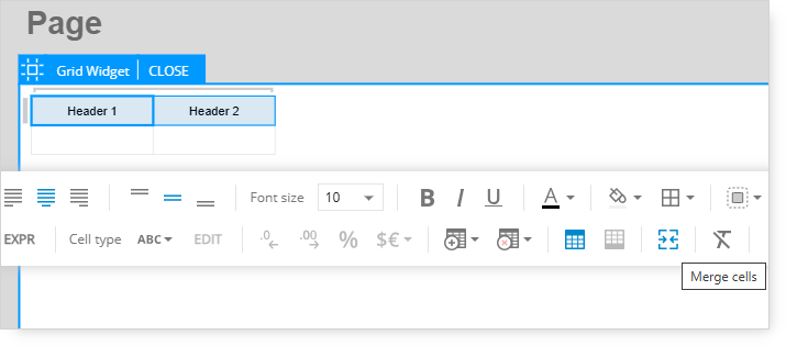
Next, select both cells of the top header.
-
This next step will merge the separate Header 1 and Header 2 cells into one cell.
-
Confirm that both header cells are selected, then click the Merge Cells option in the menu bar.
-
After this, the separate header cells will be merged into one cell.
-
Select the “Header 1” text and delete it.
-
Type “Overall Satisfaction Index” as the new column header label.
-
Resize and align the grid.
Defining the dynamic row expressions
-
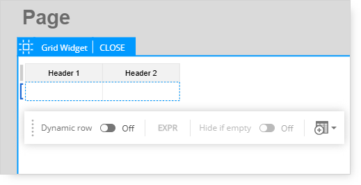
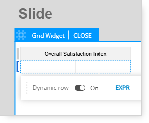
The following step is to turn on the Dynamic Row option. Dynamic columns are not needed.
-
Hover over the left border of the first cell and a blue bracket will appear.
-
Click the blue bracket to display the menu for the Dynamic Row, then turn it on.
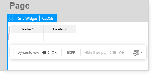
A Dynamic Row is needed because we want to create a reference for the brands listed in the first row and have the rows for the remaining brands populate automatically (and dynamically).
-
Turning on the Dynamic Row option will make the bracket red.
-
This indicates that the data range for the Dynamic Row will need to be defined.
-
After turning on the Dynamic Row, click the Expression option (EXPR) in the menu bar.
-
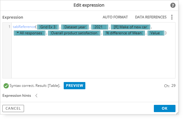
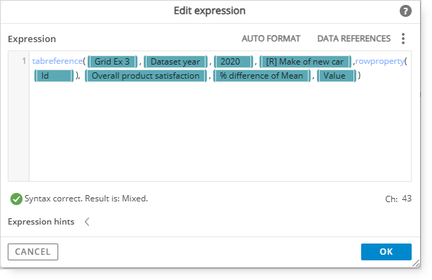
The expression editor window will appear.
Adding Expression
1. Type in tabReference and open a bracket;
2. Type in @ and select the tab where you have your analysis.
3. Then add:
This is where the data range (tab, calculations, and questions) are selected.
The data reference syntax is shown as correct with a green check mark.
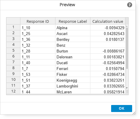
Click the Preview button to inspect the contents that will be returned in the data reference.
Makes should be listed in the table.
-
Click OK to exit the Preview window.
Additional modifications
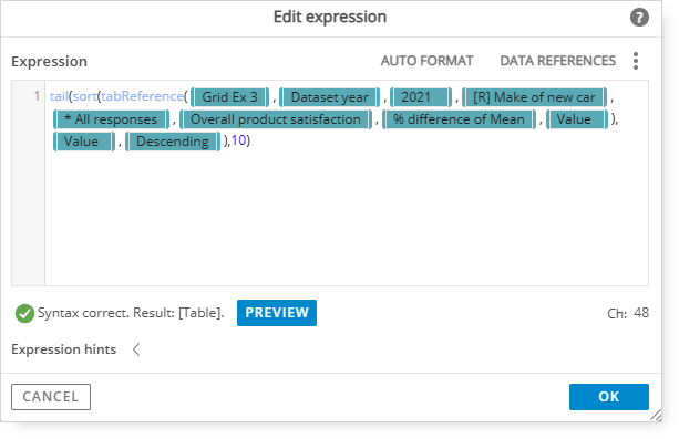
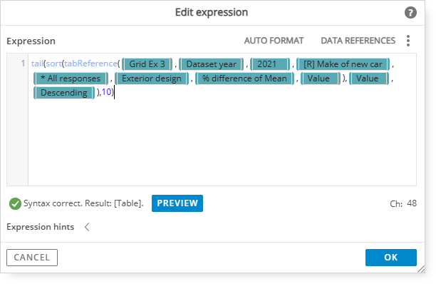
Remain in the expression editor to make additional changes to the expression. The existing expression needs to be modified to include sorting. This example will include the 10 lowest rated brands.
At the beginning of the data reference syntax, type the following:
-
Next, after “Value)” type a comma “,” then @ to display the available options.
-
Select Value since we want to add criteria to sort on.
-
After Value is inserted, add a comma, then @ to display the available options.
-
Select Descending since we want to sort with the highest value first.
-
Then add a closed parenthesis and a comma “),” after Descending.
-
Next, type in a value for the number of row responses to show after sorting.
-
Since the sorted results will show the 10 lowest rated responses, type “10” then finish the expression with a closed parenthesis.
This is the completed, modified expression that includes a tail sort on the 10 lowest rated responses.
-
Confirm that the syntax appears correct again with a green check mark.
-
Optionally preview the table results.
-
-
The bracket on the left border that was previously red is now blue.
-
The tabReference for the Dynamic row was created successfully.
Adding data to your grid structure
-
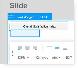
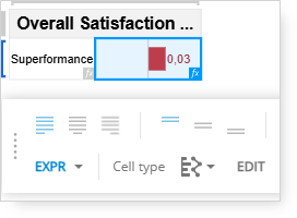
Click the first (left) cell. It will turn blue to indicate that it is currently selected.
A menu bar will appear at the bottom of the page.
-
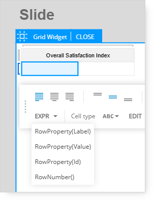
Click the arrow next to the EXPR option and select RowProperty(Label).
-
The Make label is now shown in the left cell;
The label is now shown in the left cell.
-
Next, click the right cell. It will turn blue to indicate that it is currently selected.
-
A menu bar will appear at the bottom of the page.
-
Click the arrow next to the EXPR option and select RowProperty(Value).
-
Value is now shown in the left cell.
-
The make value is now shown in the right cell.
-
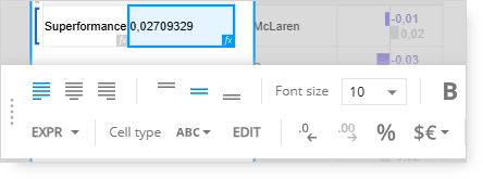
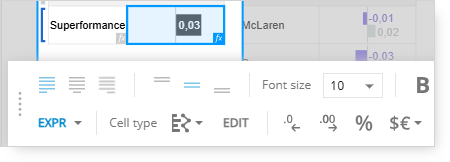
In the bottom menu bar, click the ABC menu to expand the options.
-
-
This will change the data results (mean) to a bar chart.
-
Next, click the .0 icon with the left arrow to reduce the number of decimals shown.
-
The format of the row value has been changed to show 2 decimal places only.
-
Double click the cell and the new toolbar will appear. Here you will find the paint bucket icon to specify a different color of the bar.
-
After completing the bar format changes, click "Close", at the top of the Grid, to exit the Edit mode.
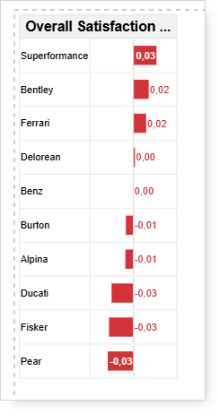
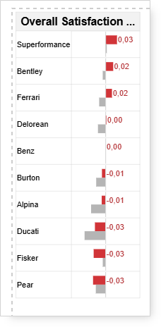
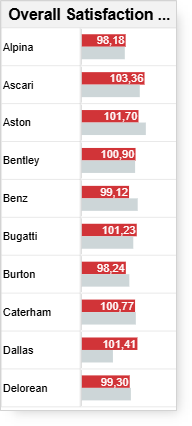
This is the finished example of a Grid with bars that include the bottom 10 makes in descending order.
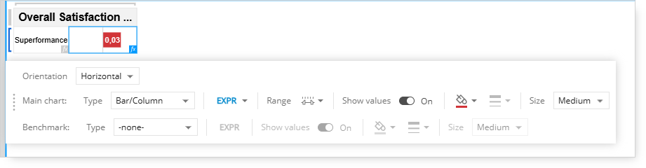
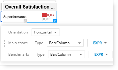
Include and display the make score for the previous year as a second bar.
-
Select Grid and click the Edit tab to get back into the Edit mode.
-
Click the right cell. It will turn blue to indicate that it is currently selected.
-
A menu bar will appear at the bottom of the page.
-
Another expression is required to display the previous year data as a bar in the selected cell.
-
Click the EDIT option in the bottom toolbar to open the chart editing toolbar and options.
1. Type in tabReference and open a bracket;
2. Type in @ and select the tab where you have your analysis.
3. Then add:
This is where the data range (tab, calculations, and questions) are selected.
-
An additional benchmark bar (grey bar by default) is included under the main bar chart. Optionally, turn off the Show Values setting for the Benchmark bars.
-
Click the Close tab at the top of the grid.
Note: The data values were turned off for the benchmark bars to give them a cleaner appearance.
This is the finished grid that shows bar charts for the current year and previous year of the sorted makes.
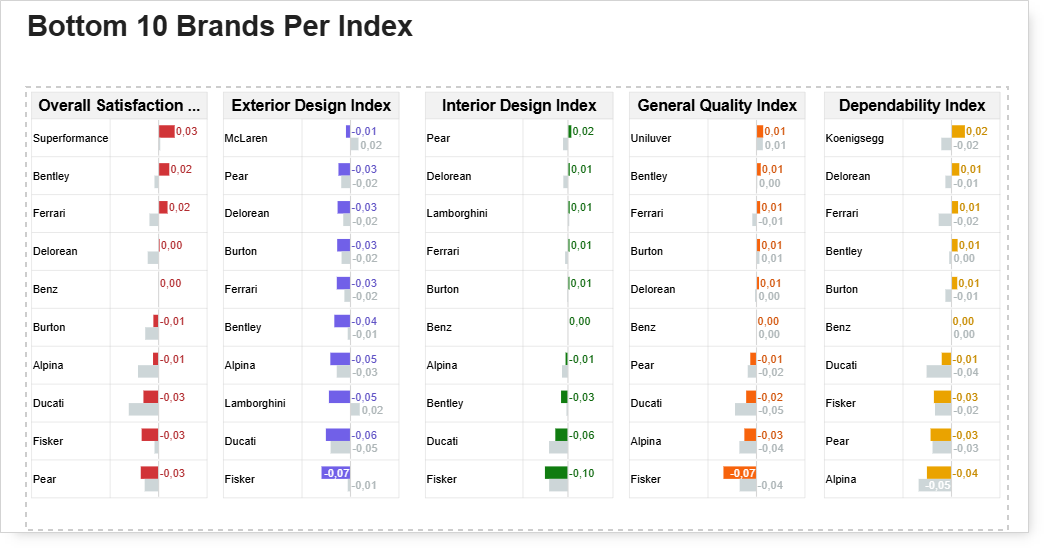
The next step will be to copy the grid that was just completed and to edit the expressions to reference the data for each of the remaining index questions. To help differentiate each index, a different color was used for the current year of each grid.
In order to copy Grid, click on the selected Grid and paste it on the slide. Each column's expression should be adjusted, so that the data refer to the respective question.
As in the second column Exterior design index, instead of Overall Product Satisfaction we should select Exterior Design:
This is the final page with the bottom ten brands.
Additional editing options
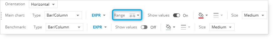
The negative bars will stand out if you change the range settings. These can be adjusted here:
If you have only positive values on your chart, these will be displayed starting from the left border: