In addition to displaying data values and bars in Grid cells, it is also possible to display line charts.
The icon for bar charts has been updated to indicate bar/line options.
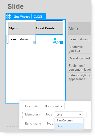
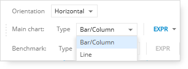
After selecting the Bar/Line chart option, the Main Chart and Benchmark menus include the option to select either a bar chart or line chart.
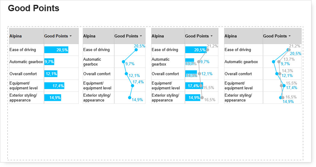
Here are some different bar/line display options with the Benchmark option turned off and on.
-
The first grid example shows the main chart as a bar chart. No benchmark data is shown.
-
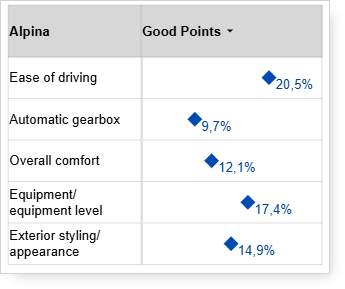
The second grid example shows the main chart as a line chart. No benchmark data is shown.
-
The third grid example shows the main chart as a bar chart and the benchmark data as a line chart.
-
The fourth grid example shows the main and benchmark charts as line charts.
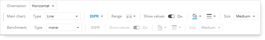
The display options for the charts shown above are controlled by the chart-type menu options.
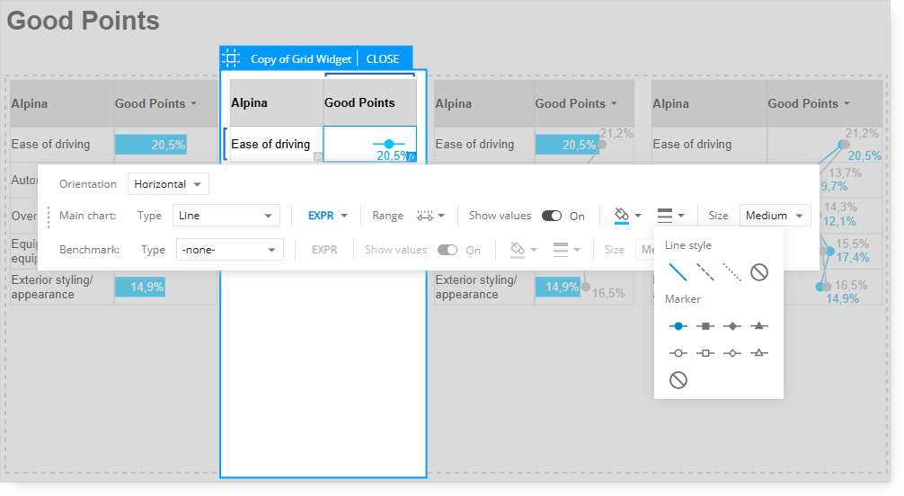
Line Style and Market Options
Customize the line charts by selecting line style and marker options.
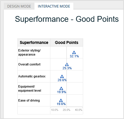
With this example, the “no line” style is being used with the triangle outline marker.
Grid - Horizontal Axis
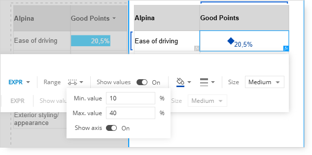
A setting to display a horizontal axis is available in the Range settings.
When the Show Axis option is set to On, a new row that includes the horizontal axis is included beneath the last row of data.
The Min, Max, and Base values can be customized to adjust the start, mid, and endpoints of the axis.
In this example, the value for the Base was set to 25%, so an additional point on the horizontal axis is included.
To change the formatting of the horizontal axis, select the row that includes the axis in Design Mode.
The toolbar options allow to change the following:
-
-
-
-
Number formatting and decimal precision;
-
Add or delete rows above and below the axis;
-
Add or delete columns to the left or right of the axis.