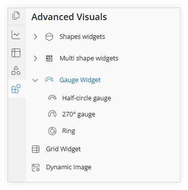
The Gauge Widget gallery is located beneath Shape Widgets and Multi Shape Widgets.
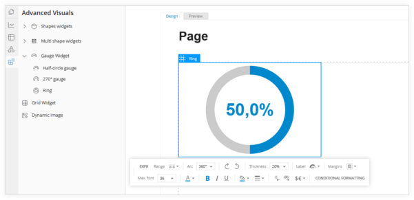
Select a Gauge Widget from the gallery and drag it to the page. In this example, we will use the Ring option.
The references used for Ring can also be applied to the Half-circle and 270 gauges.
Click on the widget to bring up Edit Mode and display the toolbar for editing options.
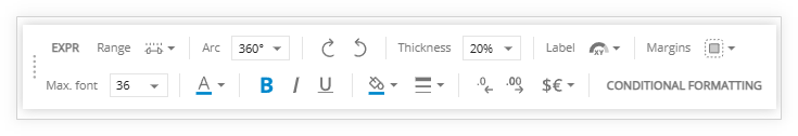
Toolbar options:
EXPR - this is the expression builder/editor to assign data references to the widget
Range - turns on/off percentages and allows for specifying the min. and max. range (if applicable)
Arc - changes the widget shape from a full circle to an arc (270 or 180 degrees)
Direction arrows - rotates the gauge widget clockwise or counter-clockwise
Thickness - increase or decrease the width of the gauge widget
Label - specifies the placement of the data label; inside, outside, or none
Margins - settings for the border of the widget and label
The bottom row consists of mostly the standard editing options.
Max. font - changes font size,
Font color - changes font color,
Bold, Italics, and Underline - these options let you emphasize text by making it thicker, slanted, or underlined for better readability and impact,
Fill and background color - these options let you customize the appearance by adjusting the inner fill and the surrounding background,
Style and Color of the border lines - allows you to customize the appearance of border lines with different designs and colors,
Increase/decrease decimals - this option lets you adjust the number of decimal places displayed for precise numerical formatting,
Add a Prefix and/or suffix - this option lets you attach text or symbols before or after a value for better context and clarity,
Conditional Formatting - this option allows you to automatically change the appearance of cells based on specific rules or values.
For steps on how to update the data reference or apply conditional formatting to Gauge Widgets, refer to the sections in the previous Data Widgetspage.