User Guide
×
Menu
Index
 

Formatting Visualizations

 
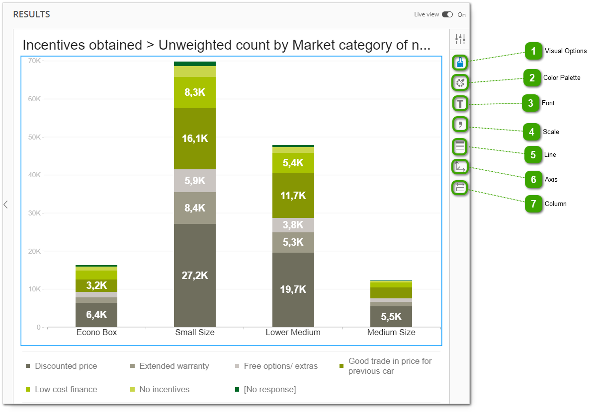
Formatting options are available in the right ribbon. They vary depending on the type of visualization. For exact formatting possibilities, go to a specific chart article.
 
Formatting Visualizations
 
1

Visual Options

1. Visual Options
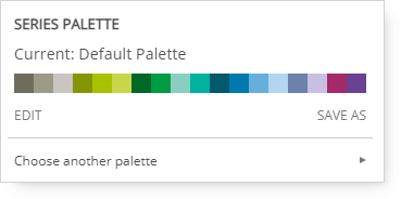
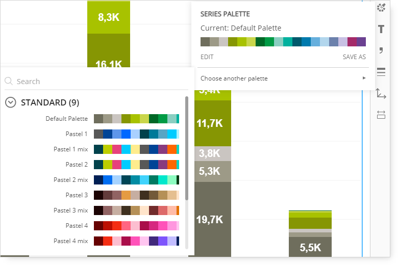
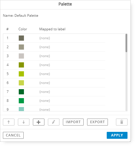
This section helps you adjust the chart to your needs by allowing you to change the font, color palette, scale, and other aspects visible on the chart.


2

Color Palette

2. Color Palette
You can select different colors for the visualization by using the color palette.
 
Once you go to the section 'Choose another palette,' you will see a list of available palettes.


You can edit the palette by selecting 'Edit':
 
3

Font

3. Font
 
The font color and shape can be adjusted by selecting the 'T' icon.
 
You can adjust the text size on Frequency Analysis, Bar/Line Chart and Scatterplot.
 
4

Scale

4. Scale
By selecting the comma icon, you can change the scale of the chart and increase or decrease the decimal precision.
 
5

Line

5. Line
Here, you can adjust the style of the line on the chart, its style and width.
 
6

Axis

6. Axis
By selecting the axis icon, you can hide the axis or make it visible and amend the maximum value visible on the axis.
 
7

Column

7. Column
Under the column section, you can adjust the column size and spacing.