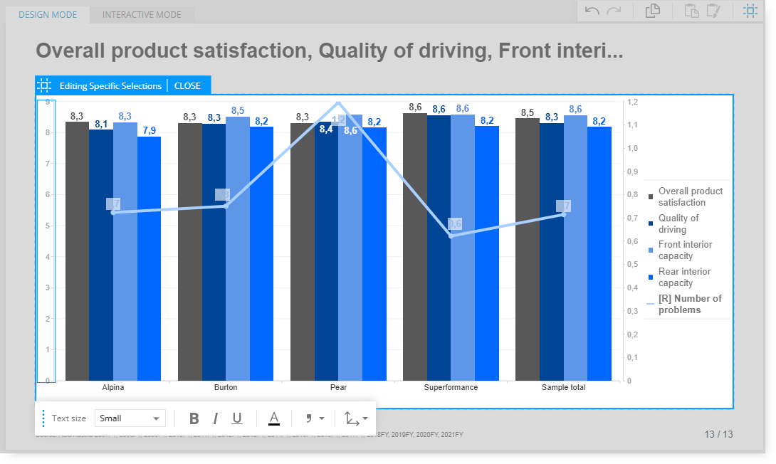
Edit mode offers new options for customizing and also supports editing specific parts of a visualization.
After clicking the visualization once to get the initial toolbox, clicking on a specific part of the visualization will display customized toolbox options that are only applicable to the area that has been selected.
These are just some of the additional editing options that are available for each chart type.
Try clicking on a specific area of a chart/visualization while in Edit mode to see which additional customization options are available. The editable area will be identified by a thin blue outline.
Click on the chart axis to assign the minimum and maximum values.
(Values can be assigned to resize the scale.)
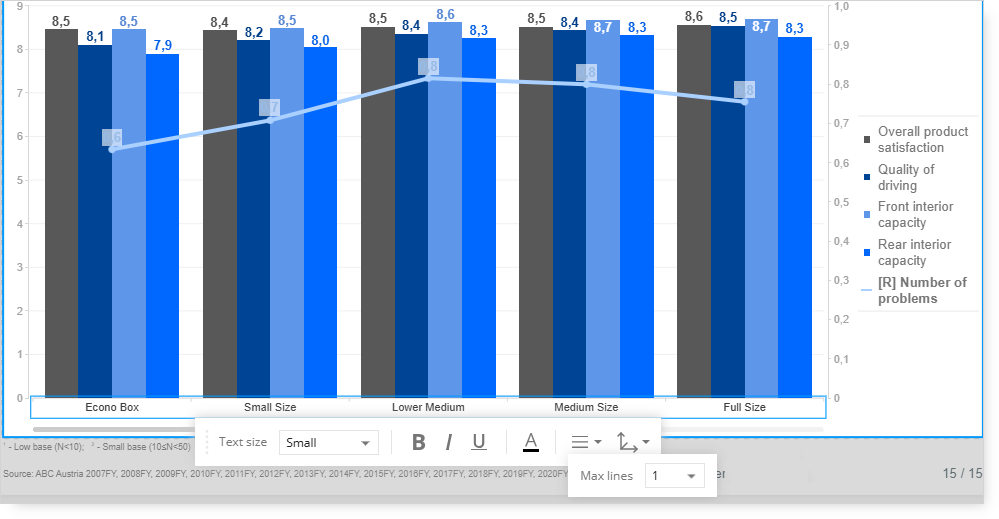
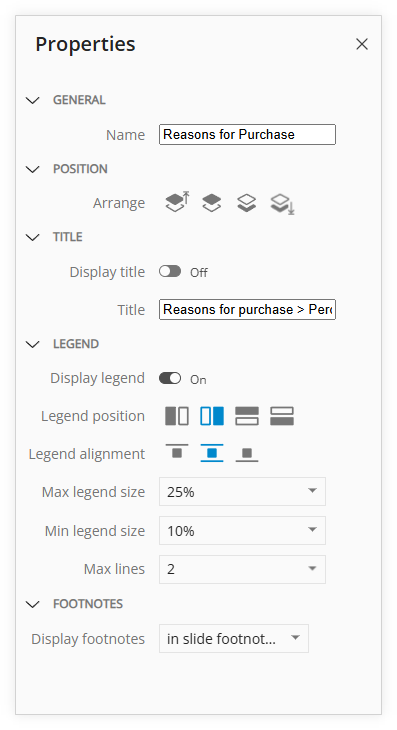
Click on the chart labels to assign the maximum number of lines to use for word wrapping.
(The number of lines to wrap the bar labels increased from 1 line to 2 lines.)
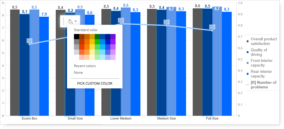
Click on a section of a bar chart to change the color of the bars.
(The blue segments of the bars will be changed to a different color.)
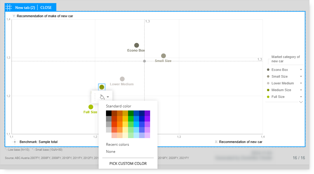
Click on a plot point of a Scatterplot to change the dot color.
(The green dot will be changed to a different color.)
Click on one of the bars in a bar/line chart to change the color of the series of bars.
(All gray bars will be changed to a different color.)
In addition to the options available in Edit mode, the Properties options are available.