Bar/Line Charts can be displayed as bar-only, line-only, or a bar-and-line combination visualization.
The bar charts are arranged as clustered bar visualizations.
Bar/Line Charts support both single-response questions such as Education, Age Groups, Occupation, etc. that sum to 100% as well as multichoice questions such as Reasons for Purchase, Problems Experienced, Item Characteristics, and other questions where the percentages sum to over 100% because a respondent can choose more than one answer.
All numeric questions can be displayed in one visualization by adding each question to the Series panel.
The following example includes options and settings for a visualization built using the Bar/Line Chart.
Begin by changing the tab template to Bar/Line Chart.
Multiple questions can be included in the Categories and Series panels.
Optional questions can be included in the Filters panel.
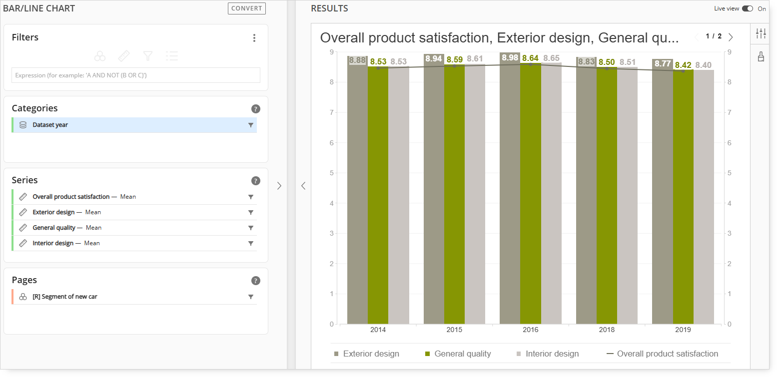
Categories
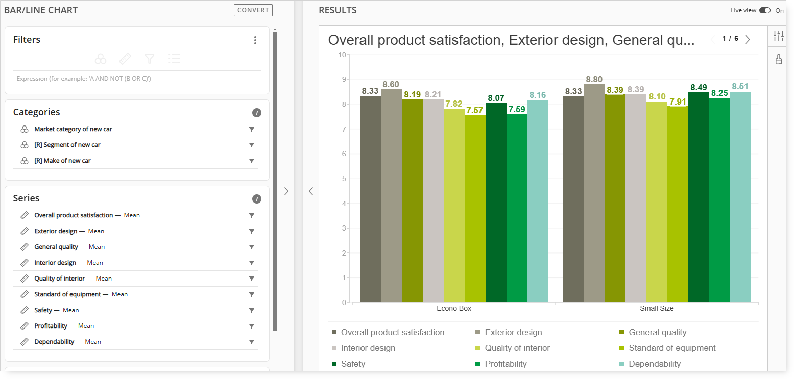
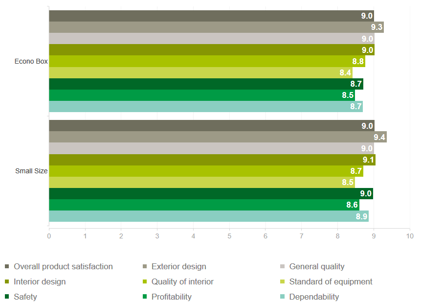
Market Category of New Car, Segment of New Car, and Make of New Car are included in the Categories panel.
Series
Multiple numeric questions are included in the Series panel.
In the example above, each numeric question is included as a separate bar for each market category of new car.
Important: When working with a Bar-Line Combination chart, at least two numeric questions are required in the Series panel.
Pages
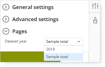
Adding the Dataset Year to the Pages panel allows for specifying and displaying only a single year of data (if multiple years of data are loaded).
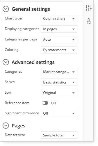
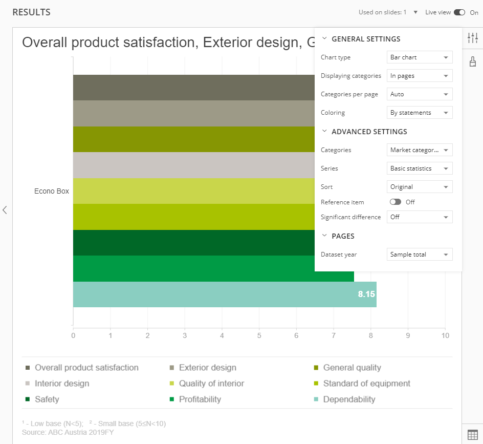
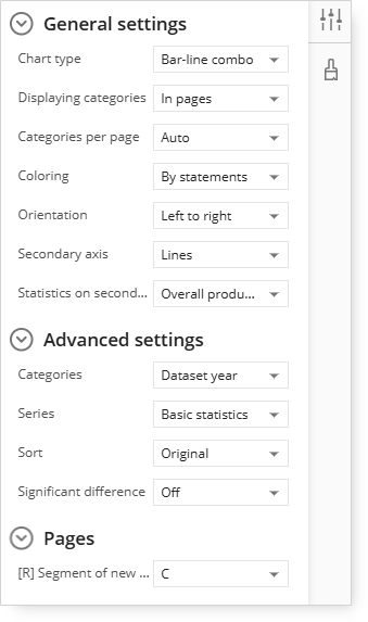
Click the Settings icon to display the available options.
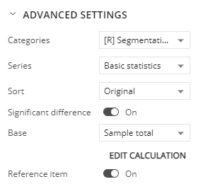
Expand the Advanced Settings options and click the Categories drop-down menu.
In the example above, Market Category, Segment, and Make were included in the Categories panel during setup, which makes them available as options in the Categories menu.
The list of items shown in the categories selector can be edited using the 'Manage' option.
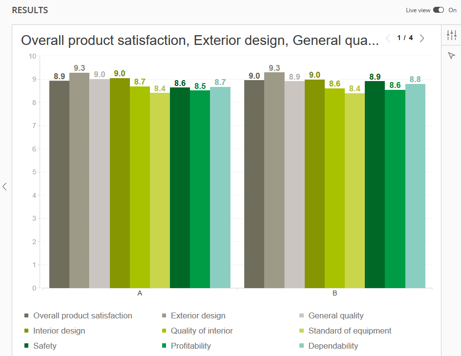
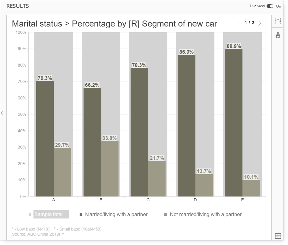
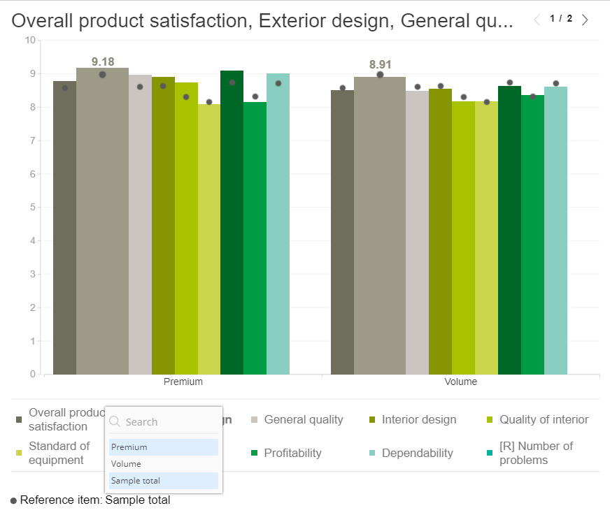
Selecting the Segment menu option changes the analysis from the Market Category of New Car to Segment of New Car.
Note the Segment of New Car descriptions:
Segment A Segment B at the bottom of each group of bars and the < 1 / 4 > notation in the upper-right.
Clicking < 1 / 4 > will advance through each of the segments, so < 2 / 4 > will display the next set of pages (Segments C and D).
Series Settings
Click the Series drop-down menu.
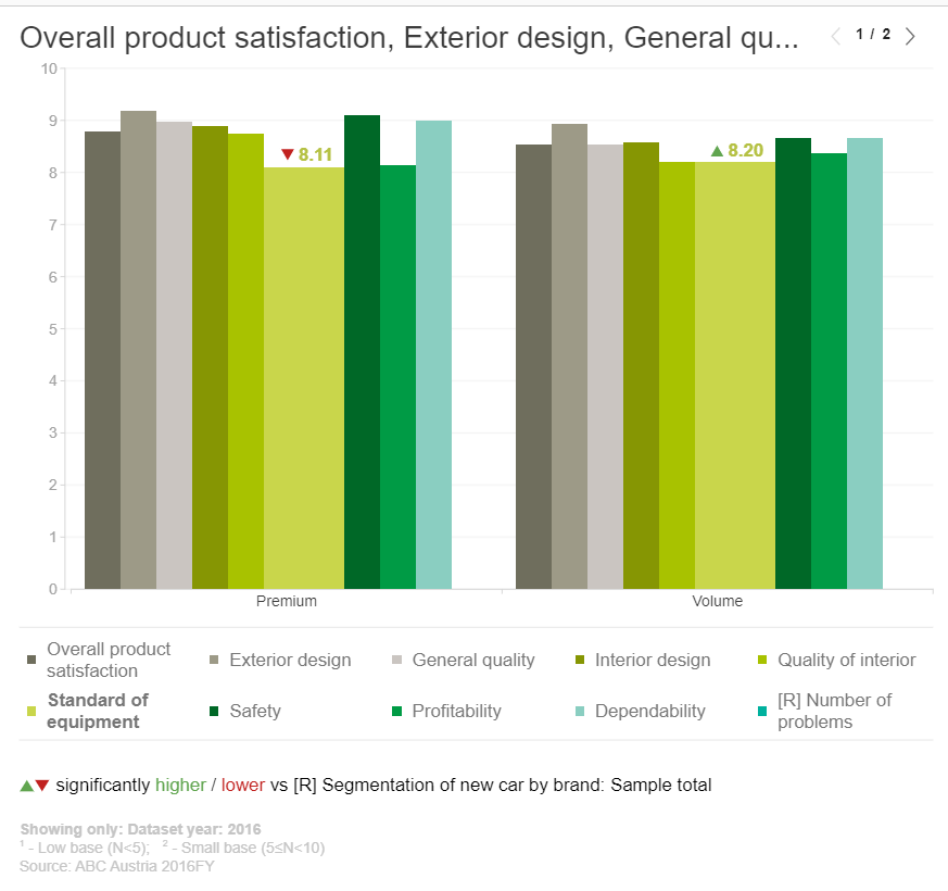
In the example above, multiple numeric questions consisting of vehicle attribute ratings were included in the Series panel.
In addition to the numeric questions, Marital Status, a category question was added.
Since Marital Status is a category question and is a different type of question than the numeric ratings, it is not automatically included and displayed with the other numeric questions.
Under the Series menu, either the numeric ratings questions can be selected (Basic Statistics), or the Marital Status question can be selected.
Selecting a category-type question, such as Marital Status, in the Series menu will change how the question is displayed as a bar chart.
Unlike numeric questions, where every question is displayed as a separate bar and is typically formatted as a mean, category questions are displayed by populating each question response as a bar.
In the Marital Status example above, the dark blue bars represent Married, the lighter blue bars represent Not Married, and the gray bar is the Total.
Significant difference
The 'Significant difference' option is available under Advanced Settings. This option is available for Bar charts, Line charts, and Bar-Line Combo charts. It is set to 'Off' by default. The legend referring to 'Significant Difference' can be found under the chart. The sample total is the base set by default. This can be changed under the Advanced Settings 'Base' option.

These icons display the 'Significant Difference'.
There is a possibility to Edit calculation, which is an option under Advanced Settings.
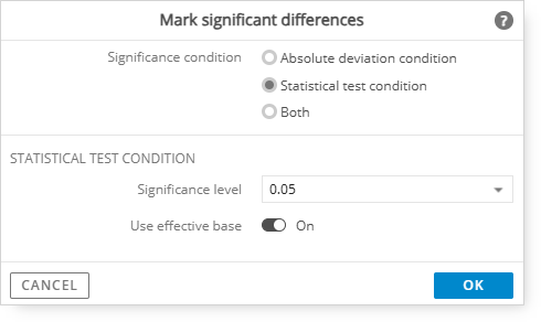
Once you select Edit Calculation, the following modal will appear where significant conditions can be chosen.
More details about 'Significant differences' can be found here:
link
Reference item
The Advanced Settings include an additional option, `Reference item`. This option is visible only for the Bar chart Chart type with an On/Off switch. It is set to Off by default. Once the option is enabled, the Reference item legend is displayed below the chart, where the reference can be changed.
The sample total is the default reference set. However, if a category's sample total(s) is disabled, the first item in order should be used by default.
The reference item can be displayed either as a continuous line (if only one series is chosen) or as dot markers (if multiple series are chosen)
The legend should adjust to display either a line or a dot marker depending on the mode (line or markers).
Pages
During the query setup, multiple years of data were included.
Since the Dataset year is included in the Pages panel, it will act as a selectable filter to allow the display of one year of data at a time in the bar chart.
Additional Features
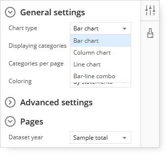
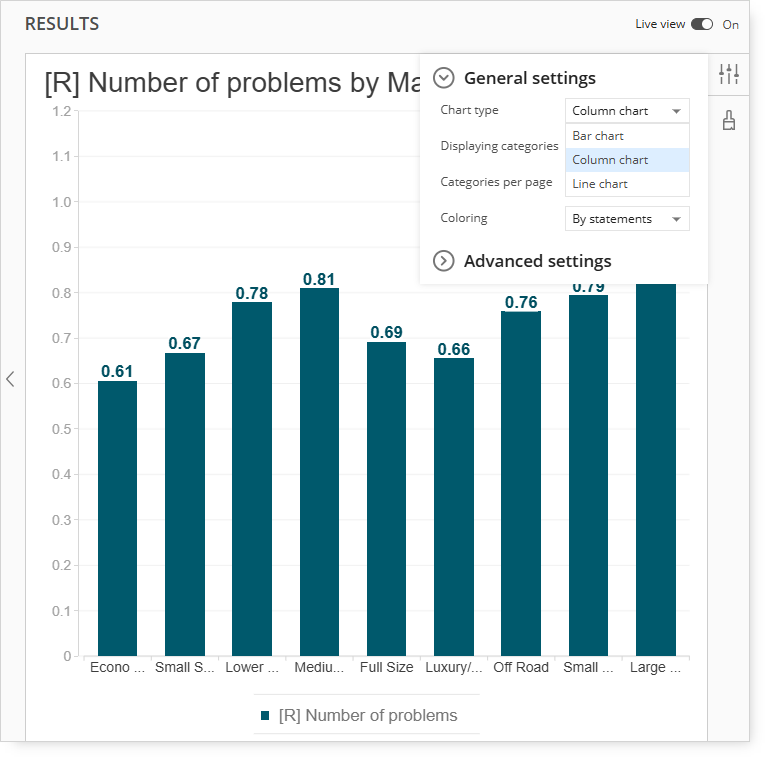
Chart Type: Bar / Line / Column / Combination Charts
To change the chart type from a Bar chart (default) to a Line chart, Column chart, or Bar-line chart, click the Chart type menu selection.
Reminder: The Bar-line combo option is only available when numeric questions are included in the Series panel.
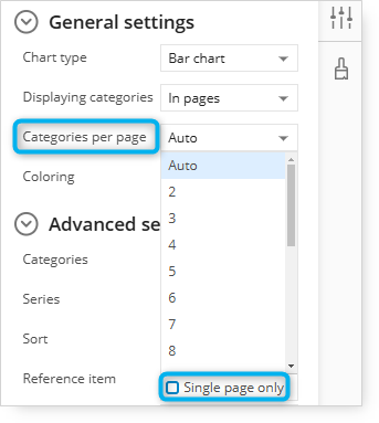
When using Categories per page, you can select 'Single page only,' which will allow you to display one page of data on the bar/line chart.
A user who is creating a report can select the 'Single page only' option under Categories per page to show just one page of data on the bar/line chart.
Bar-Line Combo Charts
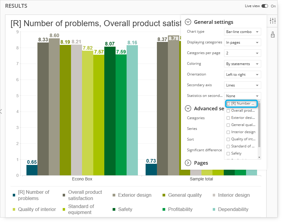
Complete the Bar-Line Combo chart by expanding the Statistics on the Secondary Axis menu.
Reminder: When working with a Bar-Line Combo chart, at least two numeric questions are required in the Series panel.
Select one or more questions to display as lines instead of bars.
Additional questions can also be added.
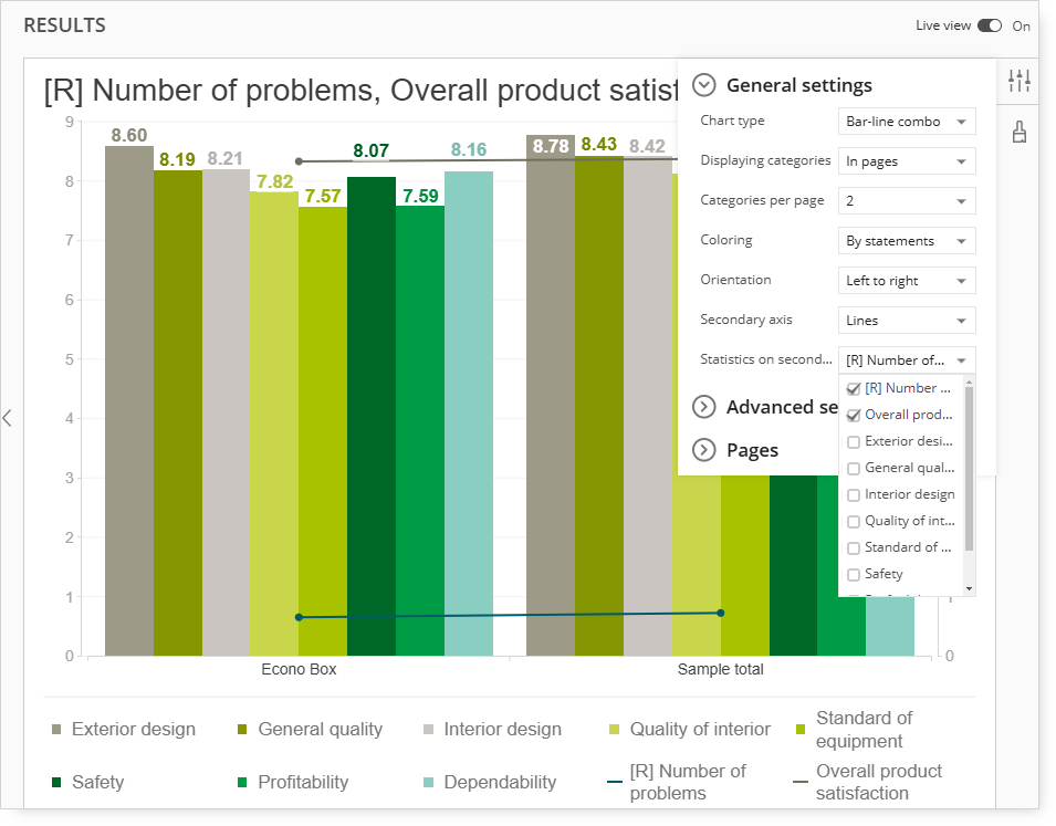
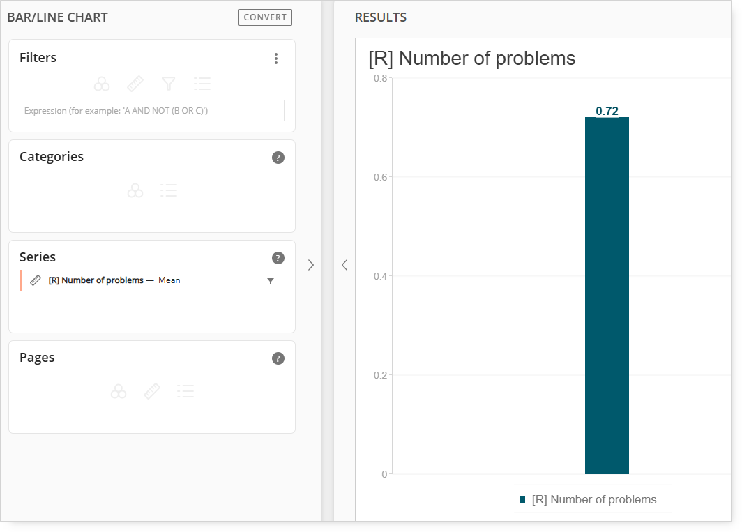
In the example above, Number of Problems has been added to the Series panel and is selected as question to display as a line.
Select more than one secondary axis menu option to display multiple line charts.
Multiple questions can be displayed as lines by selecting more than one question in the Statistics on Secondary Axis menu.
In this example, "Number of Problems" is plotted as a line chart.
Note: If all available secondary axis statistics questions are selected, the bar/line combo chart will plot all data points and change to a line chart.
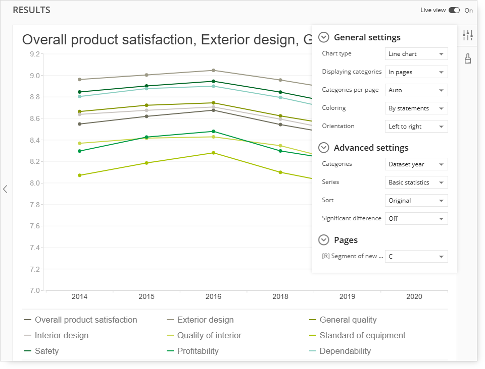
Bar-Line Combo Charts Trended
Move the Dataset Year question to the Categories panel and include a vehicle-related question (such as Segment) in the Pages panel to serve as a chart filter.
Categories should be set to Dataset Year and a selection to the Segment of New Car should be made.
(This example is including Segment C.)
Line Charts Trended
To display a trended line chart instead of a bar chart, setup the same query as the previous Bar-Line trended example above, but select the Line Chart option under the Chart Type menu.
Vertical and Horizontal Bars
The default for displaying bars is the vertical orientation. You can change that by going to the General settings list and selecting another chart type.
If you select Bar-line combo then additional Orientation option will be available on the General settings list.
To change from vertical bars to horizontal bars, click the Chart type drop-down menu and select Bart chart.
-
-
Horizontal = Top to Bottom
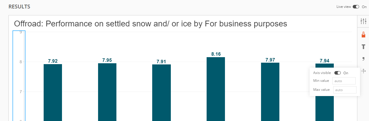
Hiding Axis
You can hide the value axis on bar/line chart by clicking on the axis and then selecting axis icon on the right side of the result window. There you will have option to change the visibility of the selected axis.
No Categories on Bar/Line chart
The Bart/Line chart will be displayed even if you add questions to Series only, and the Categories section will be empty.